1. Context and Goal
The company’s website was rebuilt with new technology to boost performance and simplify maintenance. Alongside this initiative, a Design System was created to streamline development, ensure consistency, and improve scalability. Initially, the project focused on redesigning a few key pages: the homepage, product listing, and product details.
2. Users & Audience
The primary users of the Design System were front-end developers and product designers. Developers leveraged the standardized components and patterns to build faster and more efficiently, while designers could focus on the user experience and outcomes without having to repeatedly make low-level UI decisions.
Although end users (shoppers) didn’t interact directly with the system, they were the ultimate audience. Their needs influenced decisions around accessibility, usability, and overall experience.
Although end users (shoppers) didn’t interact directly with the system, they were the ultimate audience. Their needs influenced decisions around accessibility, usability, and overall experience.
3. Roles & Responsibilities
Our team included three designers—one leading the initiative, a Junior Designer, and myself as a Mid-Level Designer—as well as two developers. We worked collaboratively across disciplines to create scalable solutions.
4. Scope & Constraints
The Design System was developed alongside other squad responsibilities, which made time and focus management a key challenge. Balancing multiple initiatives required clear prioritization and strong collaboration to keep momentum going. Additionally, maintaining up-to-date documentation in Confluence was difficult. Figma embeds often broke, and static images had to be manually replaced every time a change was made, which was inefficient.
5. Process
5.1 Component Inventory
We categorized components into two groups:
• Base Components – Simple, reusable elements like buttons and inputs;
• Feature Components – More complex UI elements with specific functions, such as a product card.
• Feature Components – More complex UI elements with specific functions, such as a product card.
We conducted an audit to identify all components required across the site, documented them in a spreadsheet, and prioritized creation based on their frequency.
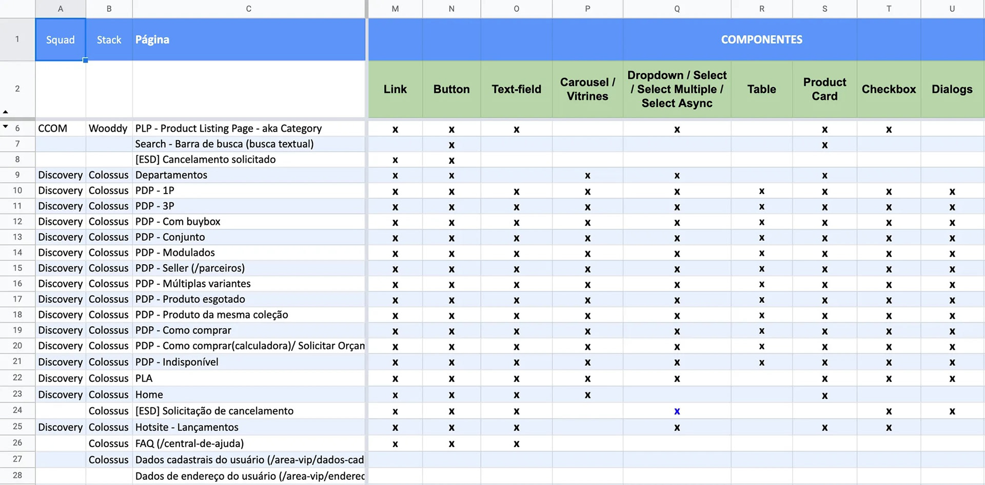
Component inventory sheet that helped to decide which components to prioritize.
5.2 Component Creation
At the time, the Design System included only a handful of basic components. We built a base library with foundational elements usable across pages and created domain-specific libraries with feature components for key areas (e.g., webstore, logged-in area). Our creation process followed these steps:
Variation Mapping → Benchmarking → Visual Design → Documentation → Review & Iteration.
Variation Mapping → Benchmarking → Visual Design → Documentation → Review & Iteration.
5.3 Variation Mapping
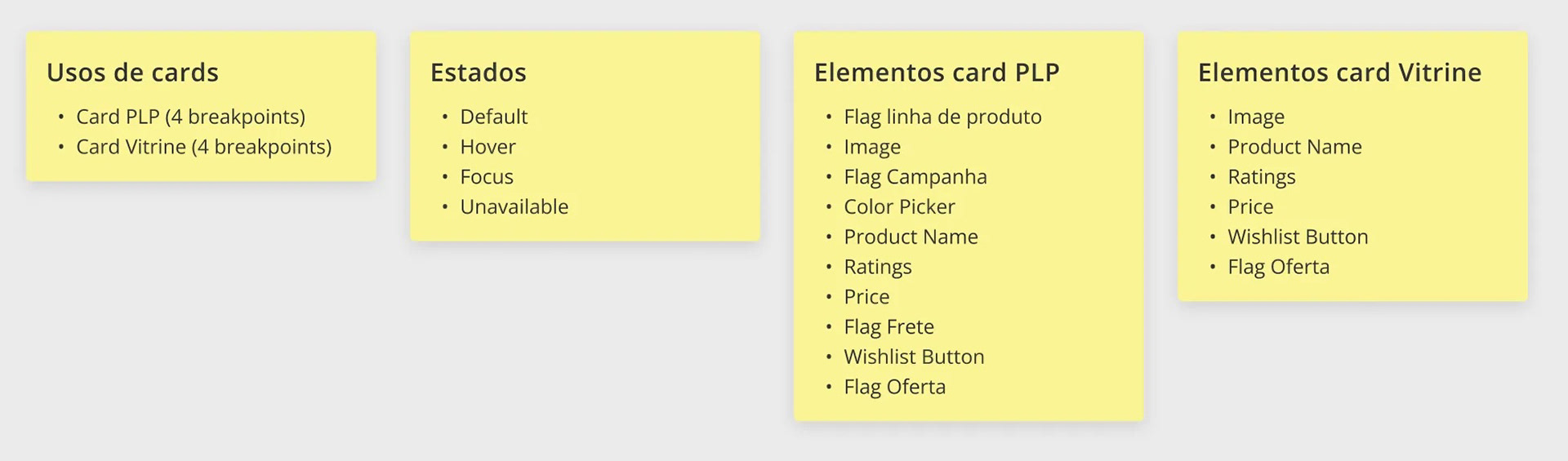
Before designing any component, we mapped out all variations and edge cases based on where and how the component would be used. For example, we created two versions of the product card: a detailed version for search results, and a compact one for carousels and suggested items.
5.4 Benchmarking
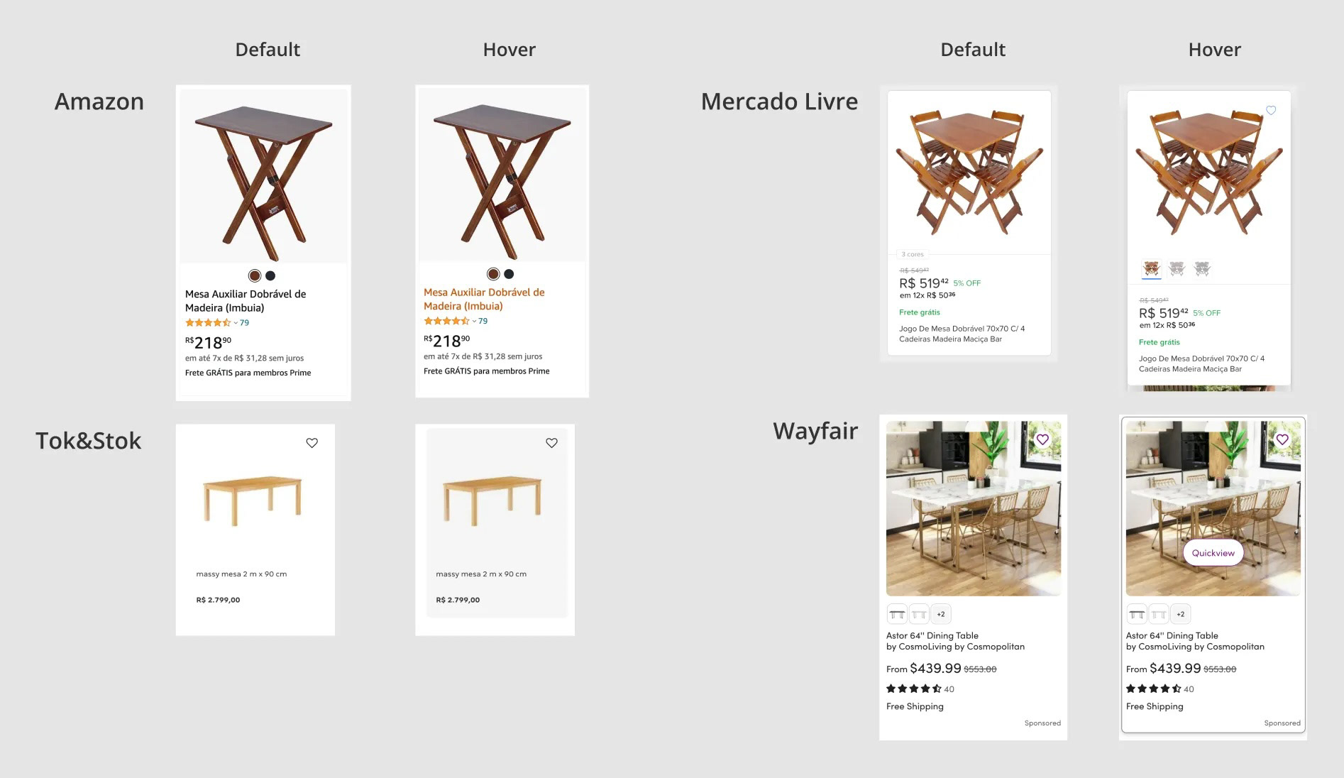
Taking Jakob’s Law into account - users spend most of their time on other sites, so they expect yours to behave similarly - I conducted a competitive analysis to understand user expectations and UI conventions. I looked at competitor websites, referenced established design systems, and pulled insights from trusted sources such as Baymard Institute, Nielsen Norman Group, and the design community on Medium.
5.5 Visual Design
All component variants were created in Figma using design tokens to ensure consistency and scalability. Accessibility was a top priority—colors followed WCAG contrast guidelines, and interactive states were designed to support keyboard navigation. Every component was built in both light and dark mode.
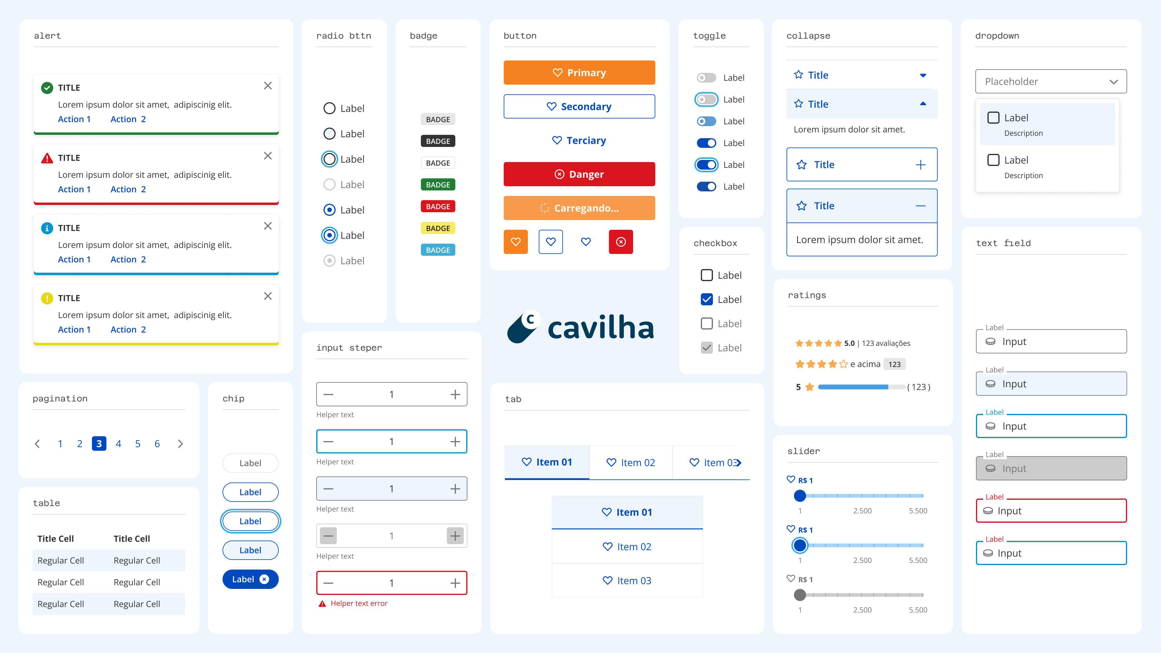
Base Library's main components in Light Mode.
Base Library's main components in Dark Mode.

Product Filters and Shopping Cart screens created with the Design System.
5.6 Documentation
We documented components in both Figma and Confluence using a consistent template. Documentation included:
• Purpose & Usage
• Anatomy & behaviors
• Visual specifications
• Guidelines for use
• Responsiveness
• Accessibility considerations
• Anatomy & behaviors
• Visual specifications
• Guidelines for use
• Responsiveness
• Accessibility considerations
Each doc also featured a Changelog for tracking iterations and a Suggestions Area where team members could propose improvements.
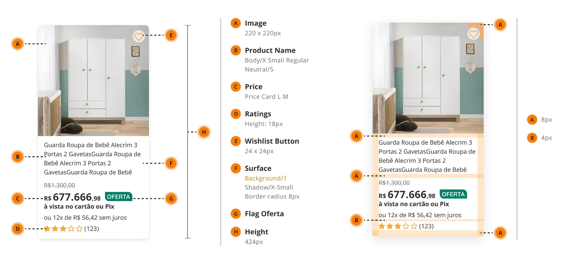
Detail of the Product Card's documentation.
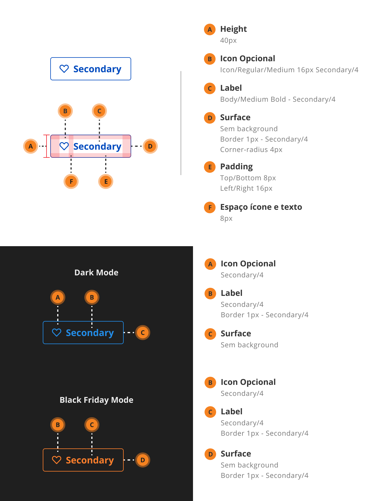
Detail of the Secondary Button's documentation.
5.7 Review & Iteration
Once a component was designed and documented, it was presented in a cross-functional review session with designers, developers, and QA. Feedback was encouraged, and a shared checklist ensured all design and technical requirements were met before development.
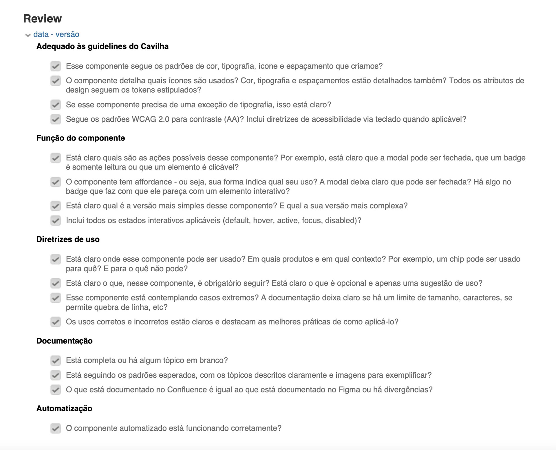
Review checklist
6. Metrics and Results
To measure the success of the Design System implementation, we tracked key quantitative and qualitative metrics aligned with the project's goals.
• Adoption Rate: Within six months, usage of the Design System expanded from 38% to 82% of the website, becoming the standard for all new pages;
• Development Speed: Reusable components reduced development time by 32%, enabling faster delivery with fewer one-off fixes;
• Team Satisfaction: NPS for the Design System increased from +14 to +62, reflecting stronger adoption and trust among designers and developers.
• Development Speed: Reusable components reduced development time by 32%, enabling faster delivery with fewer one-off fixes;
• Team Satisfaction: NPS for the Design System increased from +14 to +62, reflecting stronger adoption and trust among designers and developers.
7. Key Learnings
This was my first time working on a Design System, and it was a period of intense growth. Some of the biggest takeaways included:
• Understanding the role of design tokens and how to use them to support themes (e.g., dark mode, Black Friday mode);
• Learning to create complex, scalable, variant-heavy Figma components that are easy for others to use;
• Developing clear, consistent documentation that bridges design and development.
• Learning to create complex, scalable, variant-heavy Figma components that are easy for others to use;
• Developing clear, consistent documentation that bridges design and development.
Looking back, there are things I would do differently today. For instance, I’d implement multiple levels of tokens—primitive, semantic, and component-level—instead of a flat token structure. I’d also leverage Figma’s new Variables feature to build themes more efficiently and at scale.