
1. Context and Goals
With the shopping cart’s API due for a rebuild, we saw an opportunity to go beyond the technical and rethink the user experience. It was the perfect moment to apply the newly developed Design System and bring consistency to a key step in the purchase journey.
Our main goals were to increase conversion rates, which were below industry averages, improve performance—especially on mobile—and simplify maintenance through reusable, scalable components.
2. Users and Audience
With millions of people across Latin America shopping on the platform, the cart needed to work seamlessly for a wide range of users—different ages, backgrounds, and levels of tech familiarity. Most of them accessed the site through their phones, often on slower connections or older devices, which made performance and clarity essential. Accessibility was a core part of the redesign; every interaction, color, and element was crafted to be as inclusive and intuitive as possible, ensuring that everyone—from first-time shoppers to returning customers—could move through the checkout experience with ease.
3. Roles and Responsibilities
As the sole designer on the project, I led the entire design process—from early-stage research and mapping user journeys to high-fidelity prototypes, and handoff. I worked closely with our Product Manager to define key use cases and edge scenarios, ensuring we were solving the right problems from the start. Our remote squad included three developers and one QA analyst, and although we were distributed, collaboration flowed smoothly through regular syncs and async rituals.
4. Scope & Constraints
One of the biggest challenges was designing for scale and flexibility. With over 2 million products on the platform—ranging from teaspoons to hot tubs—the shopping cart needed to adapt seamlessly to a wide variety of item types, sizes, and purchase contexts. We also had to account for different scenarios like availability statuses, optional warranties, multiple shipping methods, and regional delivery limitations. On top of that, the experience had to work consistently across four breakpoints, from small mobile screens to large desktop monitors. Balancing all these variables while keeping the interface clean, intuitive, and performant was a core part of the design challenge.
5. Process
5.1 User Journey Analysis
To kick things off, I zoomed into the user journey to understand the cart’s role in the shopping experience. Two key moments stood out—comparison and purchase decision—both of which happen right on the cart page. I analyzed pain points and prioritized the information architecture to support these actions.
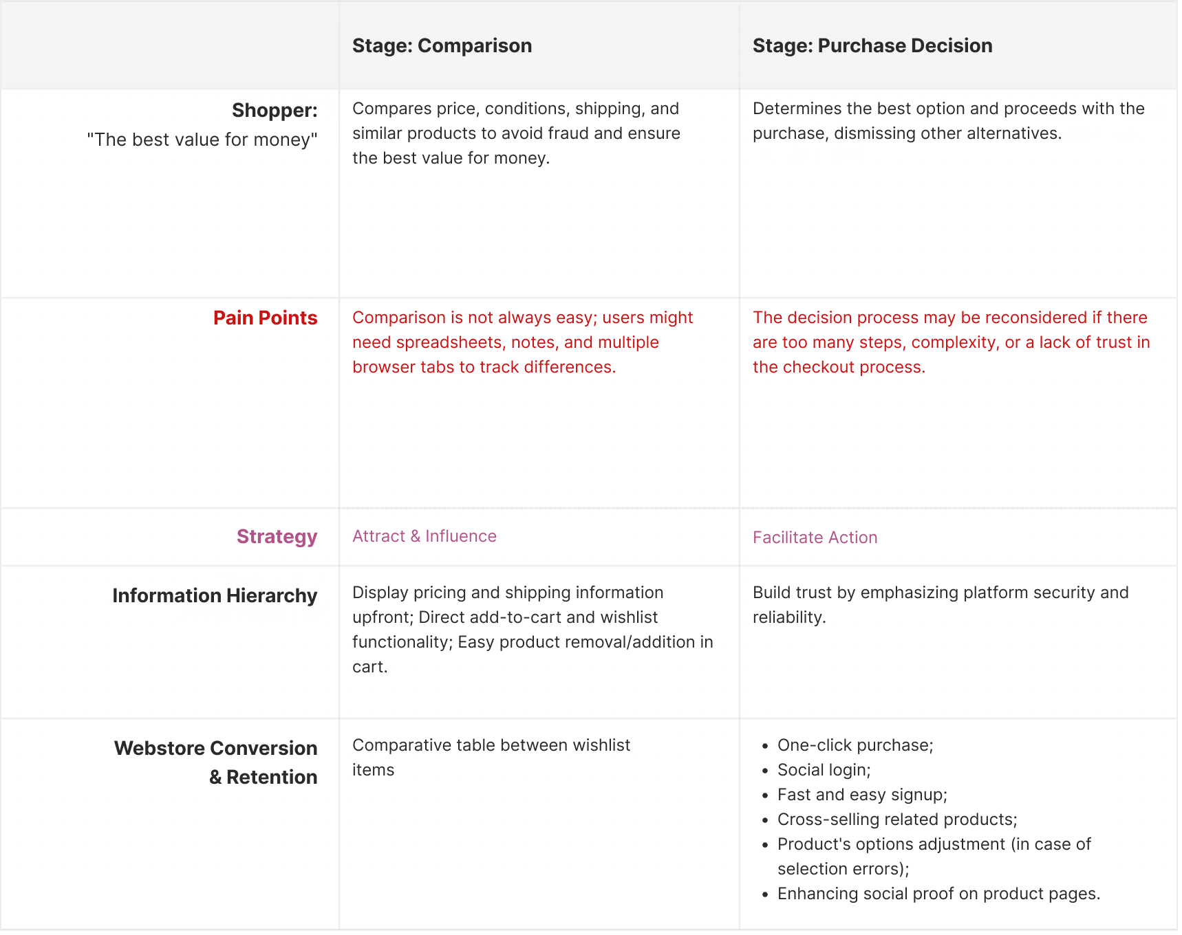
User Journey Analysis table
This deep dive revealed several usability gaps:
• Users couldn’t edit a product without leaving the page;
• Price comparison was tricky without per-item shipping costs;
• Small images and lack of standout features made evaluating items harder;
• There was no “save for later” option, frustrating for users not ready to buy;
• The absence of a "share cart" function made it harder for users to get a second opinion or continue their session across devices.
These insights shaped the foundation for what the redesigned cart needed to solve.
5.2 Desk Research
Recognizing that shopping carts follow well-established UX patterns, I leaned into Jakob’s Law: users spend most of their time on other sites, so they expect yours to behave similarly. Rather than reinventing the wheel, I focused on familiar, proven patterns.
I conducted desk research using guidelines from the Baymard Institute, which provided data-backed best practices for e-commerce. I extracted and synthesized ten core cart-related recommendations into a checklist that became a reference throughout the project.

From that, along with my journey analysis, I compiled a list of essential features:
• Save for later to reduce friction for indecisive shoppers;
• Share cart to support multi-device use and social decision-making;
• Geolocation-based freight calculation and per-item delivery estimates to simplify comparisons;
• Edit products directly in-cart to streamline the experience;
• Easier application of discount coupons;
• Cart merge functionality to combine products added while logged out with those in the user’s account upon login, and to handle cart sharing scenarios;
• Empty cart state with helpful navigation options;
• Product suggestions based on cart contents.
Some features were also derived from business requirements:
• Salesperson code for commission tracking in physical stores;
• Extended warranty options with clear terms;
• Cashback system to incentivize return purchases.
• Extended warranty options with clear terms;
• Cashback system to incentivize return purchases.
Benchmarking
With Jakob’s Law still in mind, I ran a benchmarking analysis with top-performing e-commerces: Zeedog, Amazon, and Mercado Livre, as well as Baymard-recommended platforms like Wayfair, Nordstrom, and Etsy. I mapped how each of the desired features functioned across these sites, collecting examples and identifying patterns to guide both design and prioritization.
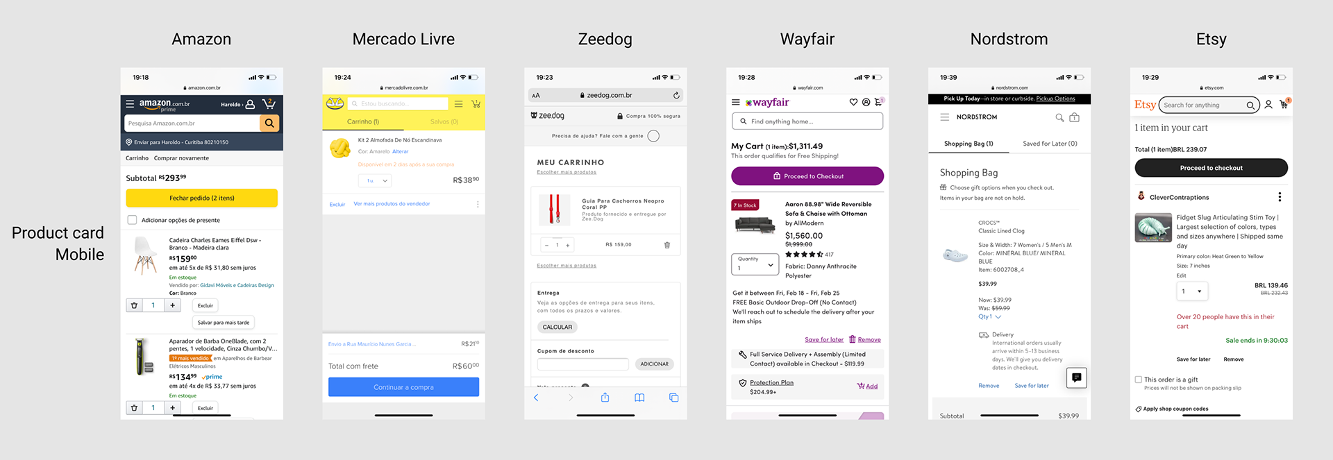
A comparison of competitor's product cards.
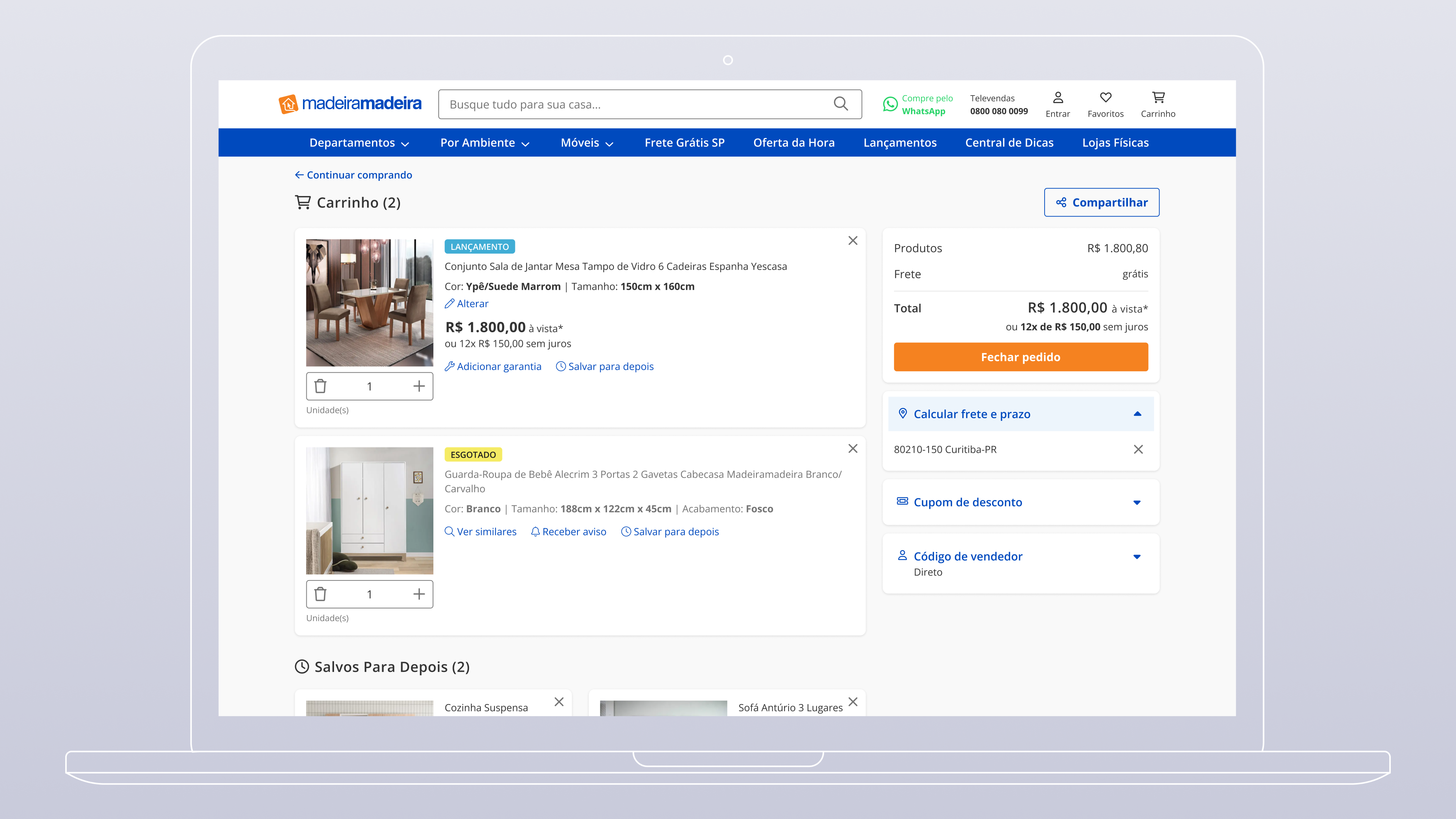
User Flows
To bring structure to the experience, I created 16 user flows in FigJam, covering both core and edge-case scenarios. This helped clarify how each feature would work within the cart and how users would move through the experience. I aligned closely with the PM and devs during this phase to ensure technical and business feasibility before jumping into design—helping to avoid major rework down the line.

User flow for calculating shipping costs.
Prototypes
With flows in place and insights synthesized, I built high-fidelity prototypes using the Design System. I followed a mobile-first approach, designing for the smallest breakpoint first, then scaling up to the other three. This ensured visual and functional consistency across devices.

The first 3 screens show the whole cart page (except for the footer) and the last screen shows an "Edit product" modal.
While most components were pulled from the Design System, I also created a few local components specific to this file to meet unique layout and interaction needs.
Results and Learnings
Once the prototypes were finalized and approved, the plan was to roll out features gradually—prioritizing those with the highest user and business impact while balancing technical complexity. The team intended to validate each release through A/B testing, measuring improvements in cart usability and conversion rates. Unfortunately, I left the company before development began, so I wasn’t able to follow through on the implementation or track long-term results.
Still, this project was a key milestone in my growth as a designer. Collaborating closely with the Product Manager taught me how to align design decisions with strategic business goals while staying grounded in user needs. I became more intentional in how I handled feedback, using research and best practices to guide conversations and advocate for the user. It also helped me sharpen my communication and cross-functional collaboration skills—giving me the confidence to navigate complex UX challenges in a more structured, outcome-driven way.