1. Context and Goals
The app was built on an outdated white-label component library that lacked alignment with PaGol’s visual identity. This resulted in a generic, inconsistent interface that failed to convey trust—an essential quality for any financial product. The limited flexibility of the system made it difficult for designers to iterate or scale the UI as new features were developed. As the product evolved, so did the need for a cohesive, accessible, and future-ready style guide—one that not only reflected the brand but also supported the product’s growth and usability.
The old UI Design using the white label library.
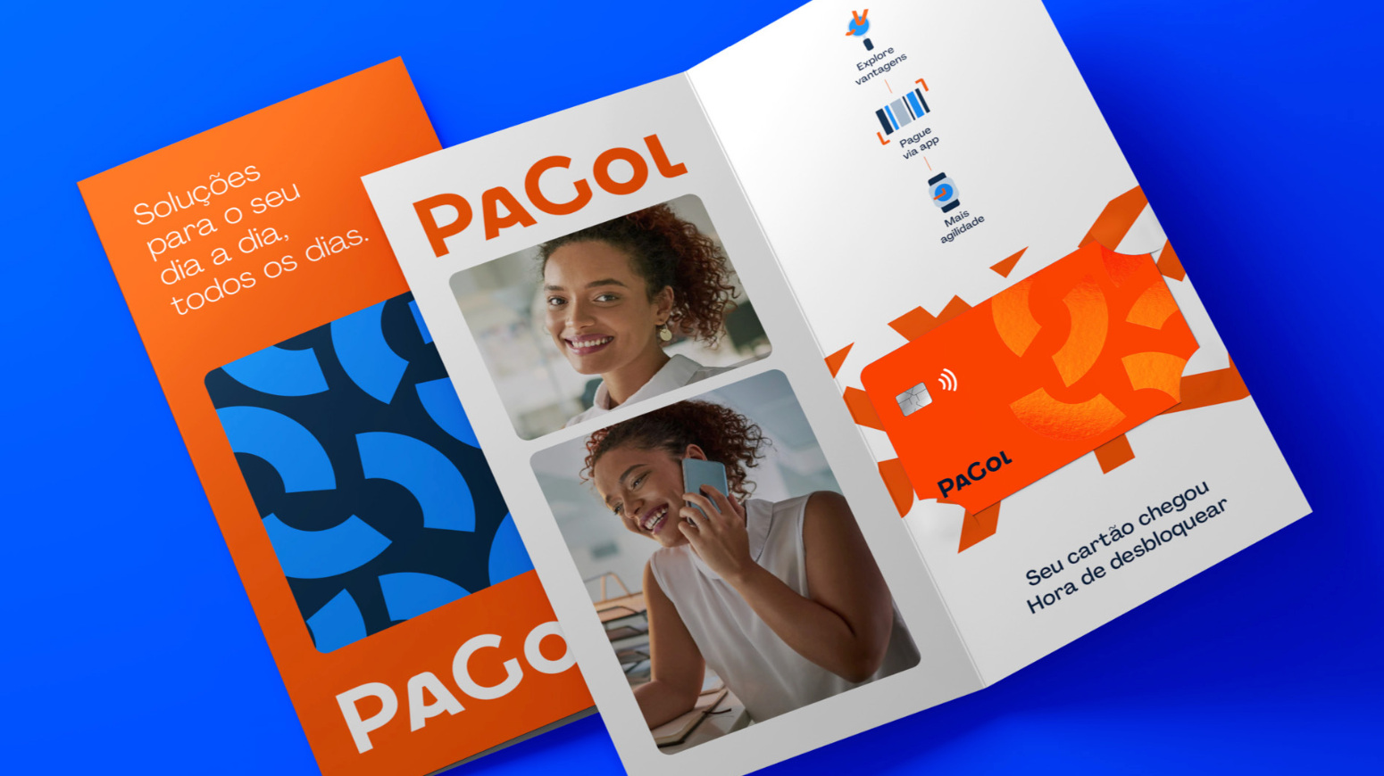
An example of printed material from the brand guidelines.

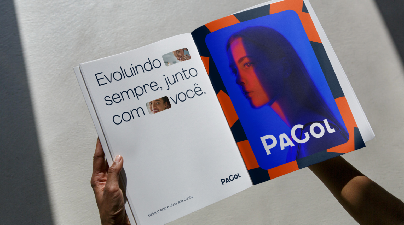
An example from the brand guidelines.
An example of a magazine ad from the brand guidelines.
2. Users and Audience
The primary users of the Style Guide were internal product teams. Designers used it to ensure consistency in UI patterns, hierarchy, and interaction behaviors. Frontend developers relied on clearly defined specifications, spacing rules, and component states (e.g., hover, focus, error) for efficient implementation. Though the Style Guide wasn't directly exposed to end users, it significantly impacted their experience by promoting clarity, consistency, and accessibility. Key accessibility practices—such as proper color contrast, touch target sizing, and keyboard navigation support—were embedded from the beginning to ensure that the product was inclusive and met industry standards.
3. Roles and Responsibilities
I led the initiative end-to-end, establishing the foundations—color palette, typography, spacing system—and setting up the process and documentation templates. I also managed the backlog of tasks and coordinated priorities. The effort was highly collaborative and involved two other designers. We co-created components and met weekly for design critiques, where we reviewed each other's work, discussed improvements, and aligned on implementation.
4. Scope & Constraints
While the ideal solution would have been a full Design System, it wasn’t a current priority for the client due to budget and resource limitations. As a result, we focused on delivering the next best thing: a robust, scalable Style Guide. Unlike a full Design System, we didn’t work with design tokens or have engineers dedicated to the initiative. Documentation was lighter, and we developed the guide alongside our day-to-day responsibilities within product squads.
5. Foundations
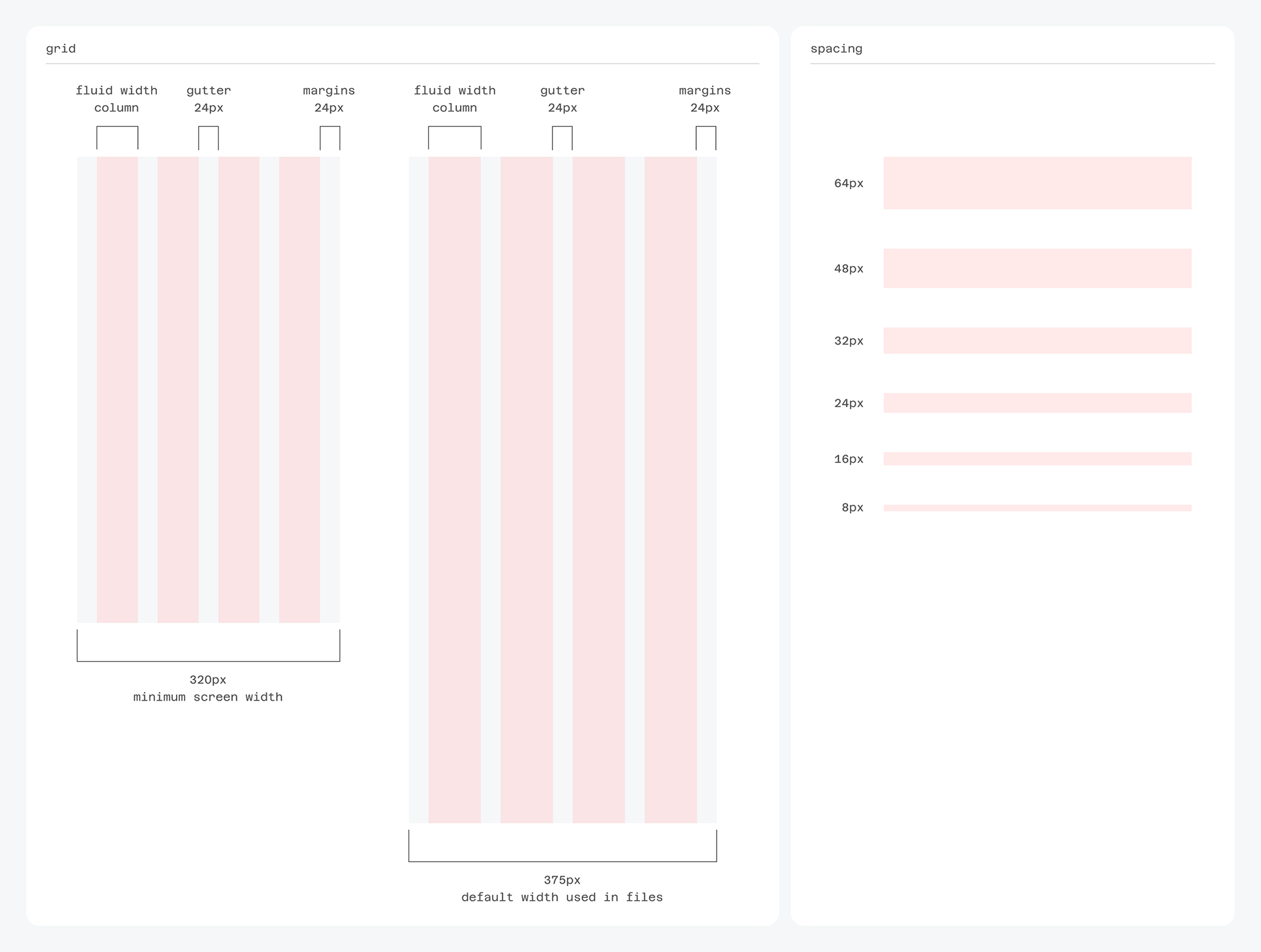
5.1 Grid & Spacing
We used a fluid 4-column grid with 24px gaps and margins. A 4px baseline governed all vertical and horizontal spacing decisions. Horizontal spacing had six predefined steps—8px, 16px, 24px, 32px, 48px, and 64px—with usage rules and examples documented. For vertical rhythm, simply following the 4px base grid ensured visual harmony without needing additional presets.
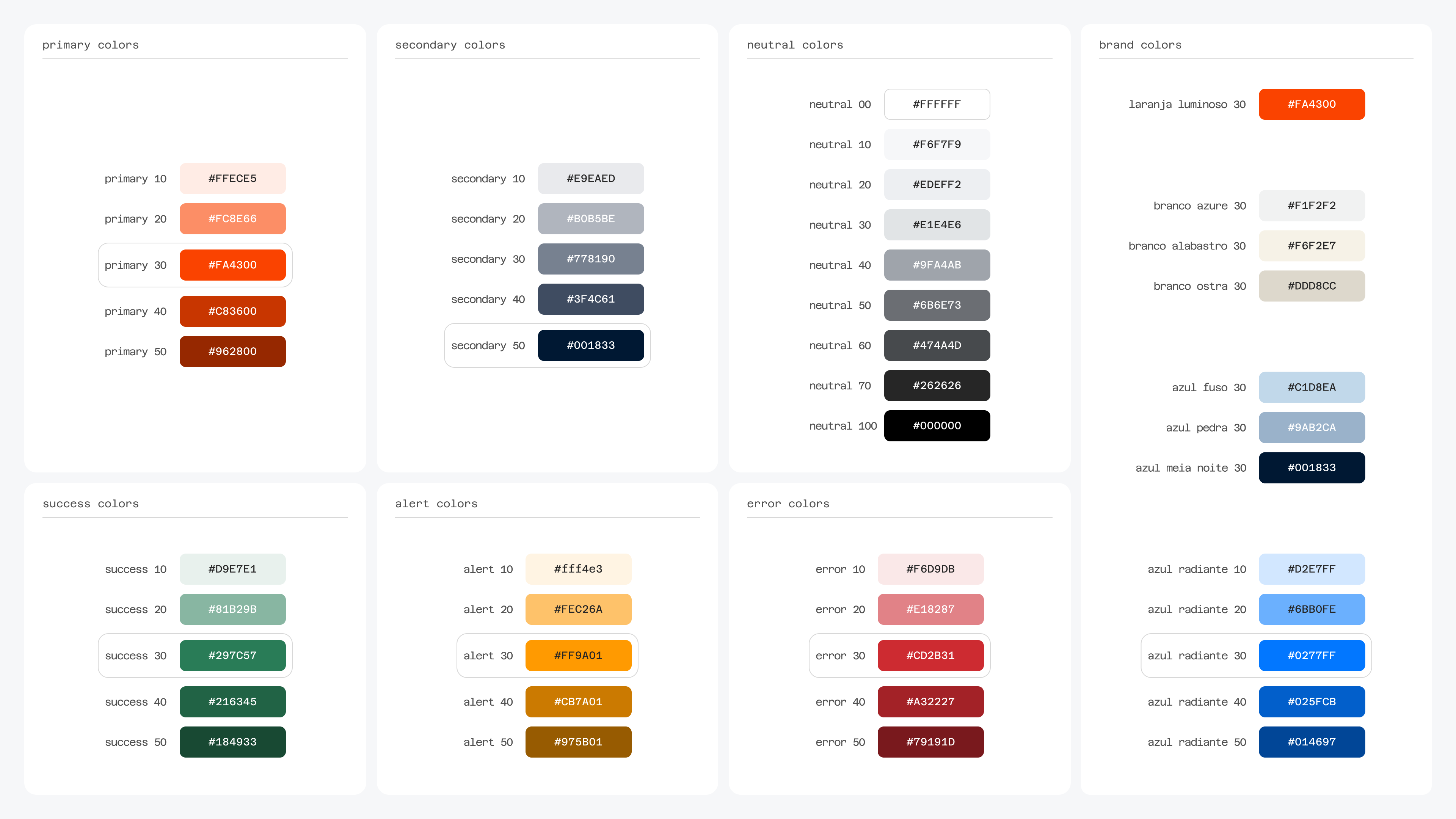
5.2 Colors
We built on the brand’s existing palette by introducing functional color sets for Neutrals, Success, Alert, and Error states. All text colors passed contrast tests to meet accessibility standards. We also defined clear usage guidelines—for example, body text, interactive elements, disabled states, and backgrounds—making it easier for designers to apply colors consistently.
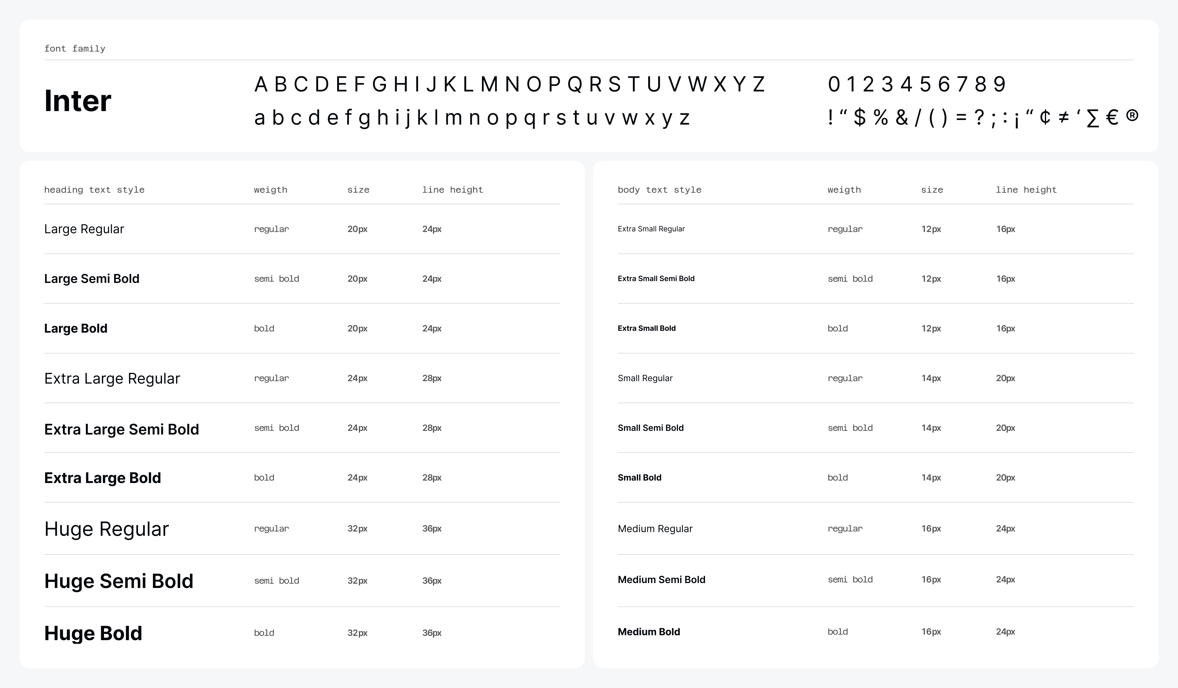
5.3 Typography
We chose Inter for its legibility and range of weights. The system included six font sizes: Extra Small, Small, Medium (used in body and labels), and Large, Extra Large, Huge (used in titles). Each had three weights—Regular, Semibold, Bold—resulting in 18 total text styles, each documented with practical examples and usage recommendations.
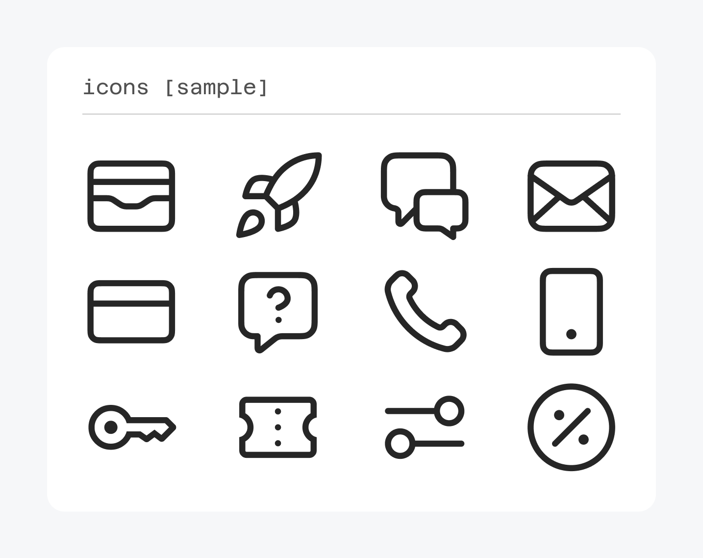
5.4 Iconography
We chose Material Icons by Google as our icon library because it aligned well with the brand’s tone—featuring slightly rounded corners, a clean and minimal line style, and a consistent 24x24px size. The library offered a comprehensive set of icons that covered nearly all use cases, minimizing the need for custom illustrations.
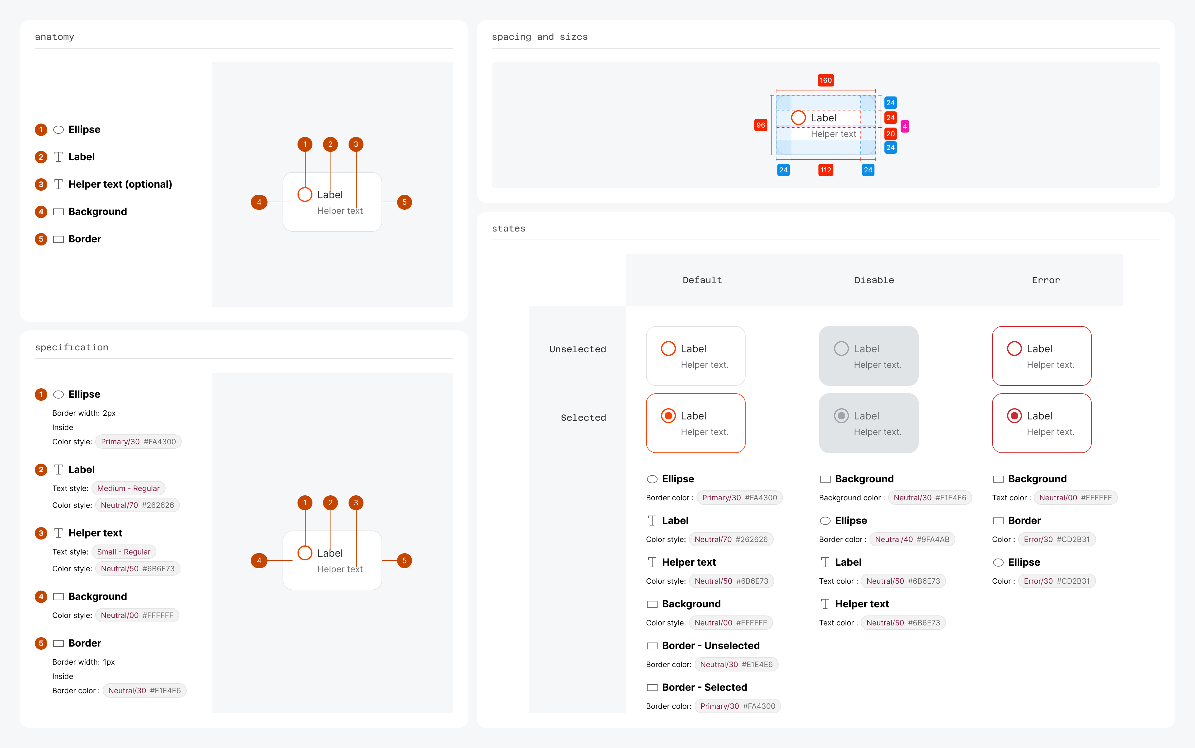
6. Documentation
We documented everything directly in Figma, with the help of the DesignDoc Spectral and EightShapes Specs plugins. Each component followed a standardized structure:
• Intro: what the component is and its purpose;
• Best Practices: do’s and don’ts, usage tips;
• Accessibility: design decisions to support inclusive use;
• Anatomy: breakdown of the component’s parts, including optional elements;
• Spacing and sizes: internal layout rules with clear annotations;
• Specifications: typography, colors, and visual details;
• Variations: different styles or formats of the component;
• States: visual and behavioral states like hover, active, disabled.
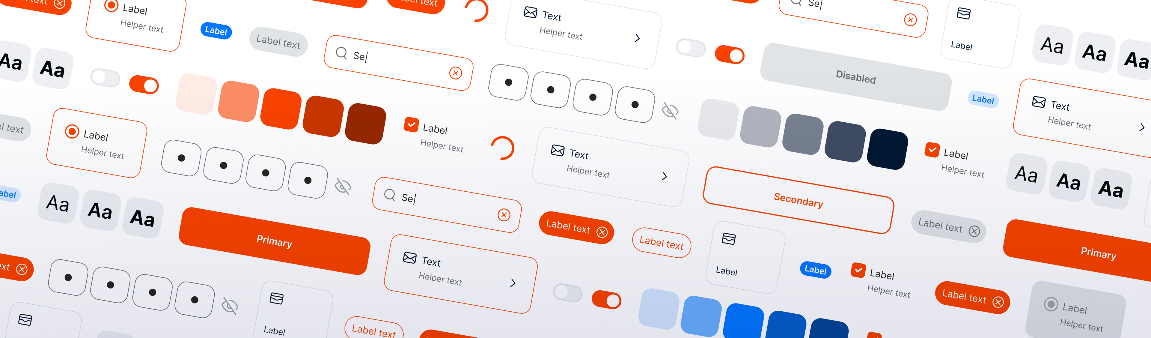
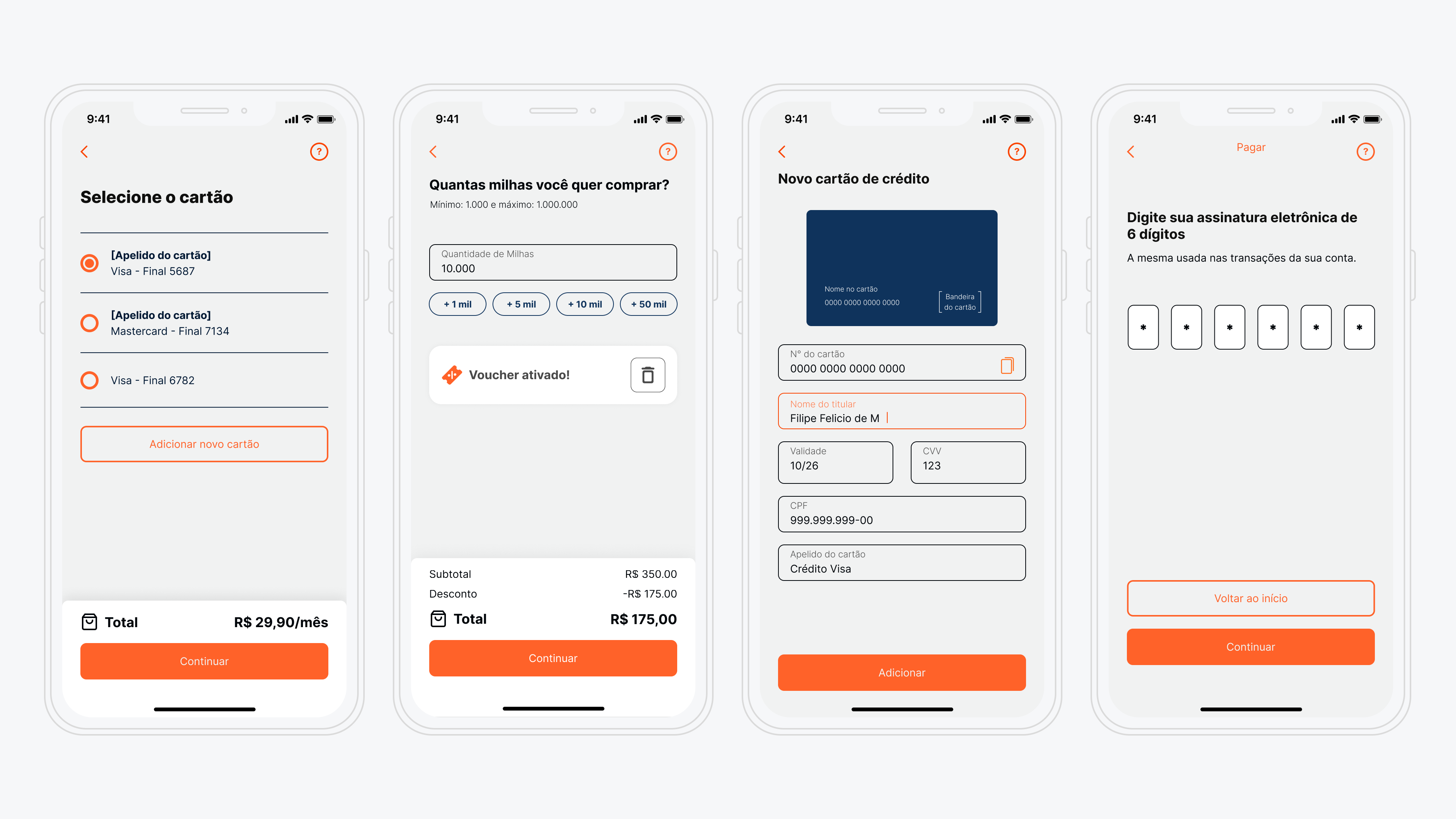
7. Final Designs
Below are some key visuals comparing the old interface with the updated one, along with new screen designs and highlights from the component library. These examples illustrate how the new visual language brought clarity, consistency, and a more professional tone to the app—better reflecting the brand and improving the overall user experience.
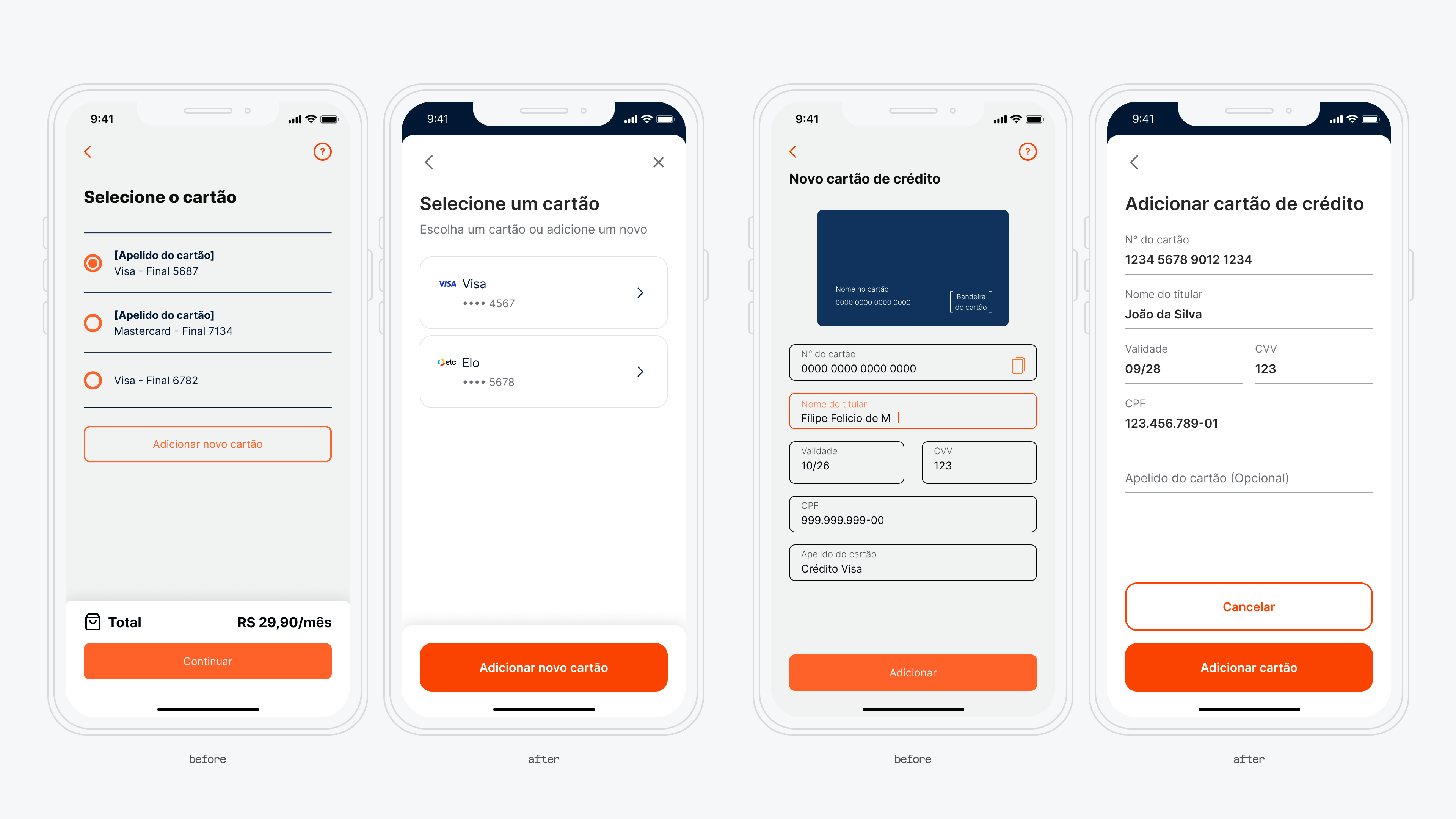
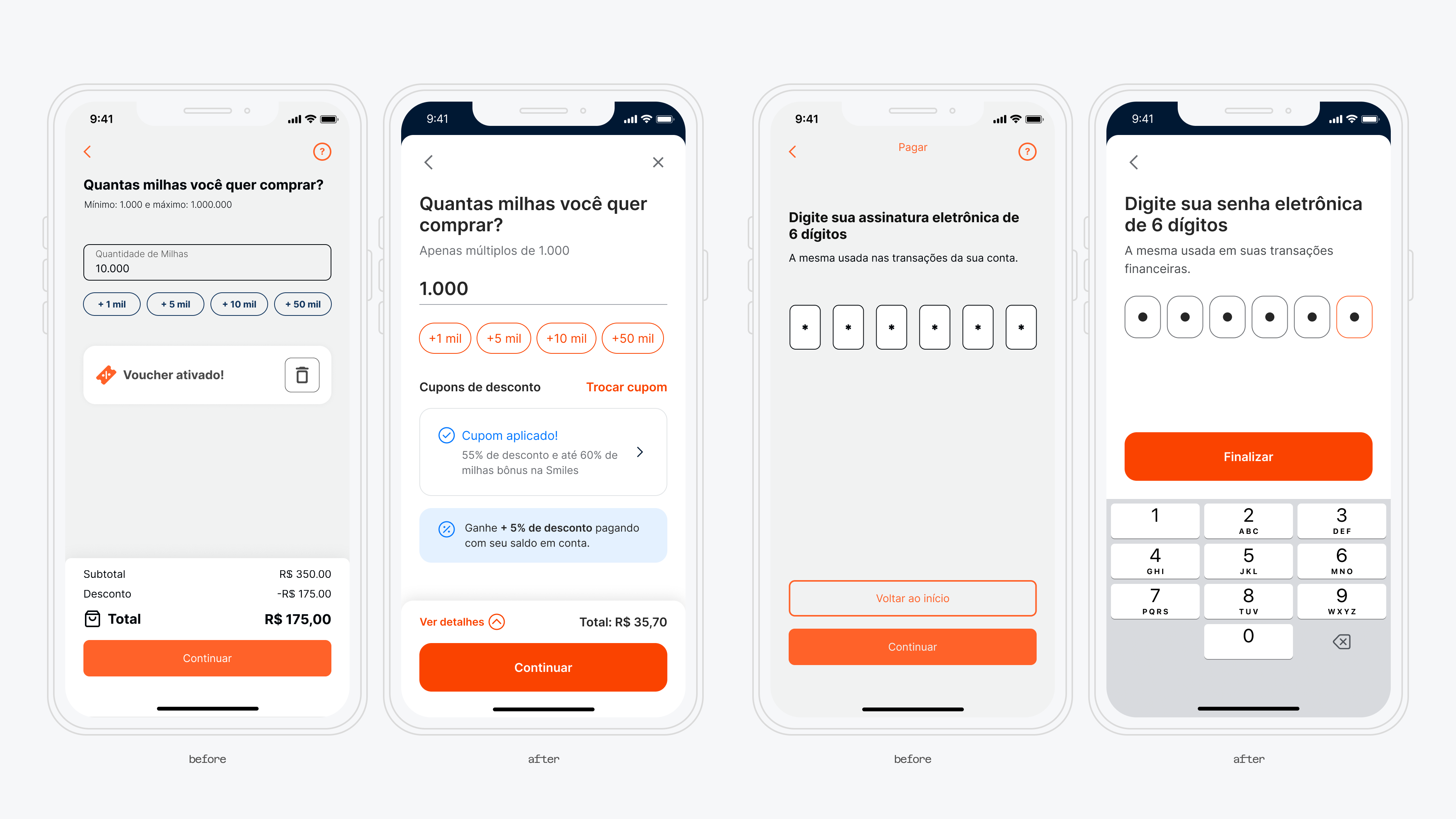
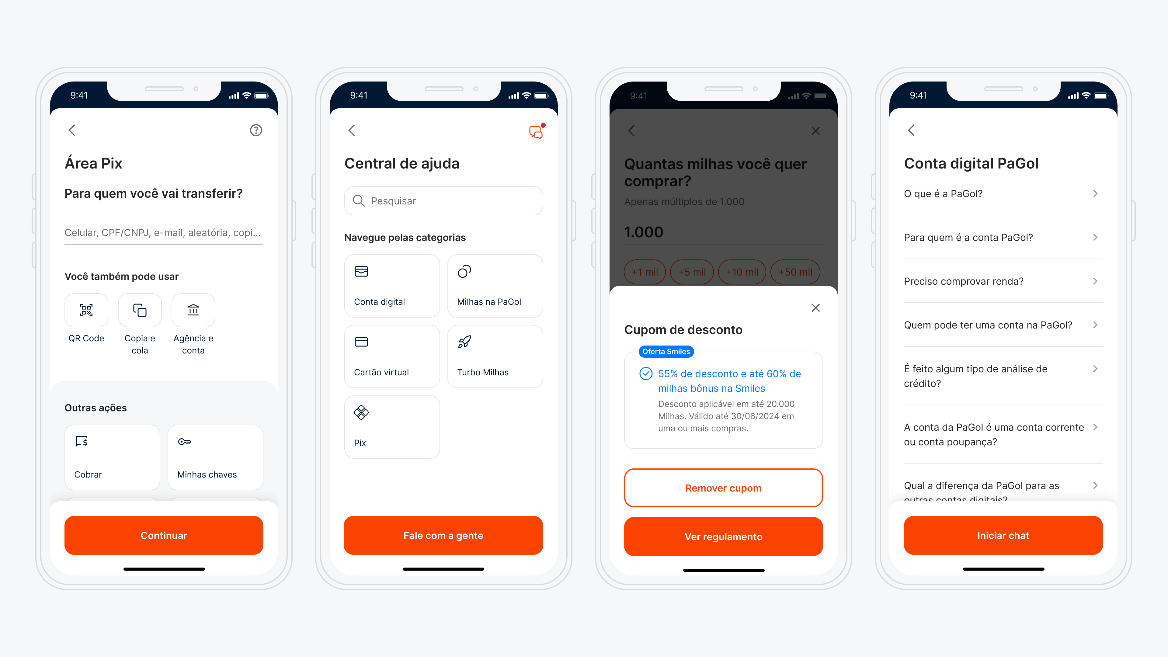
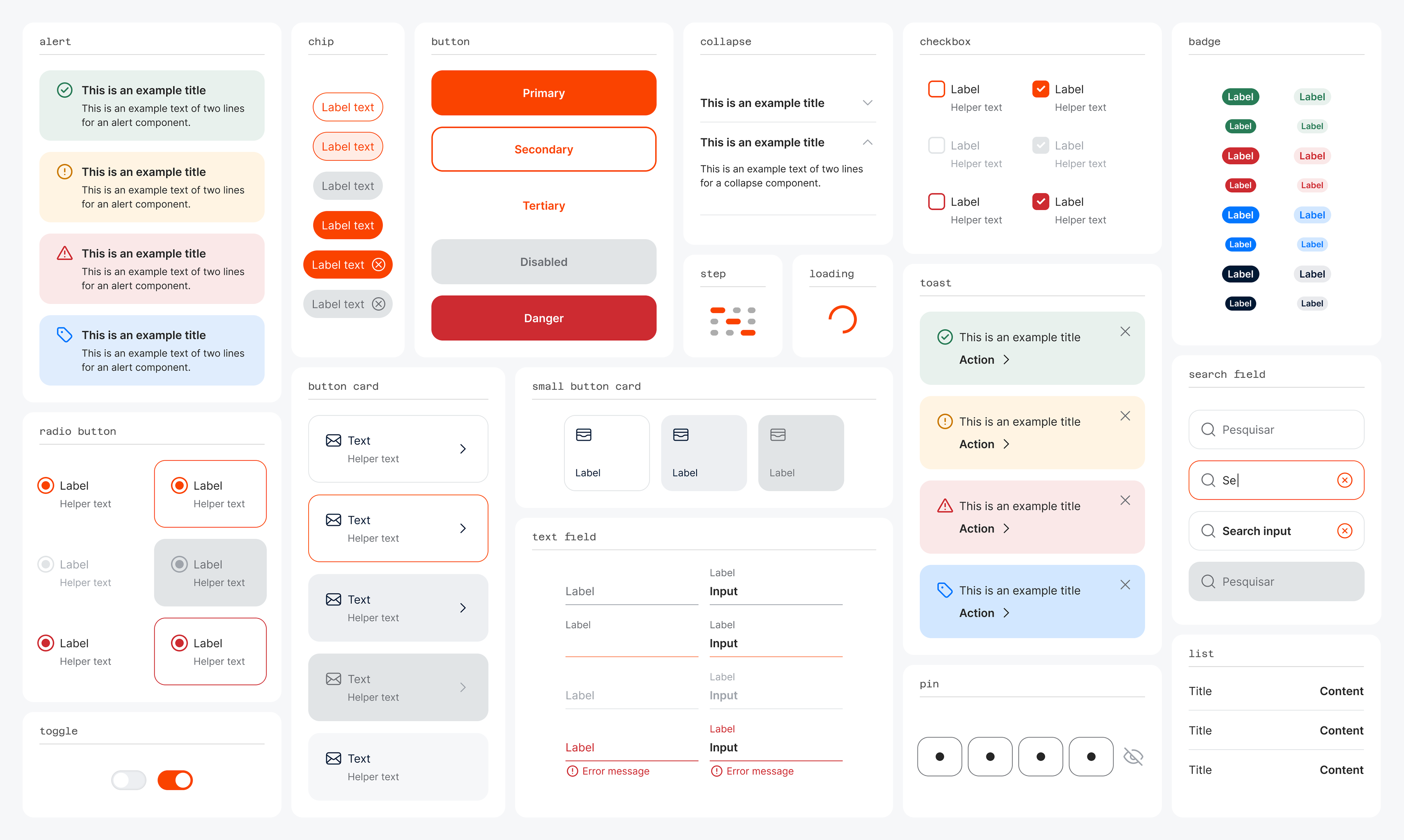
The main components created in the library.
8. Outcomes & Lessons Learned
The Style Guide brought immediate value by improving visual consistency and speeding up design and development decisions. Designers spent less time on repetitive choices, and developers had clearer specs to work from. Even without a dedicated Design System team, our collaborative process—with weekly critiques and hands-on documentation—fostered alignment and efficiency. This project laid a solid foundation for a future Design System and proved that even with limited resources, a well-structured Style Guide can elevate both team workflows and user experience.