Role: Motion Designer / Team: Design Chapter (3 designers) / Platform: Mobile App (iOS-Android) / Scope: Motion, UX/UI Design, Prototyping / Tools: Figma, Jitter / 2025
1. The Problem
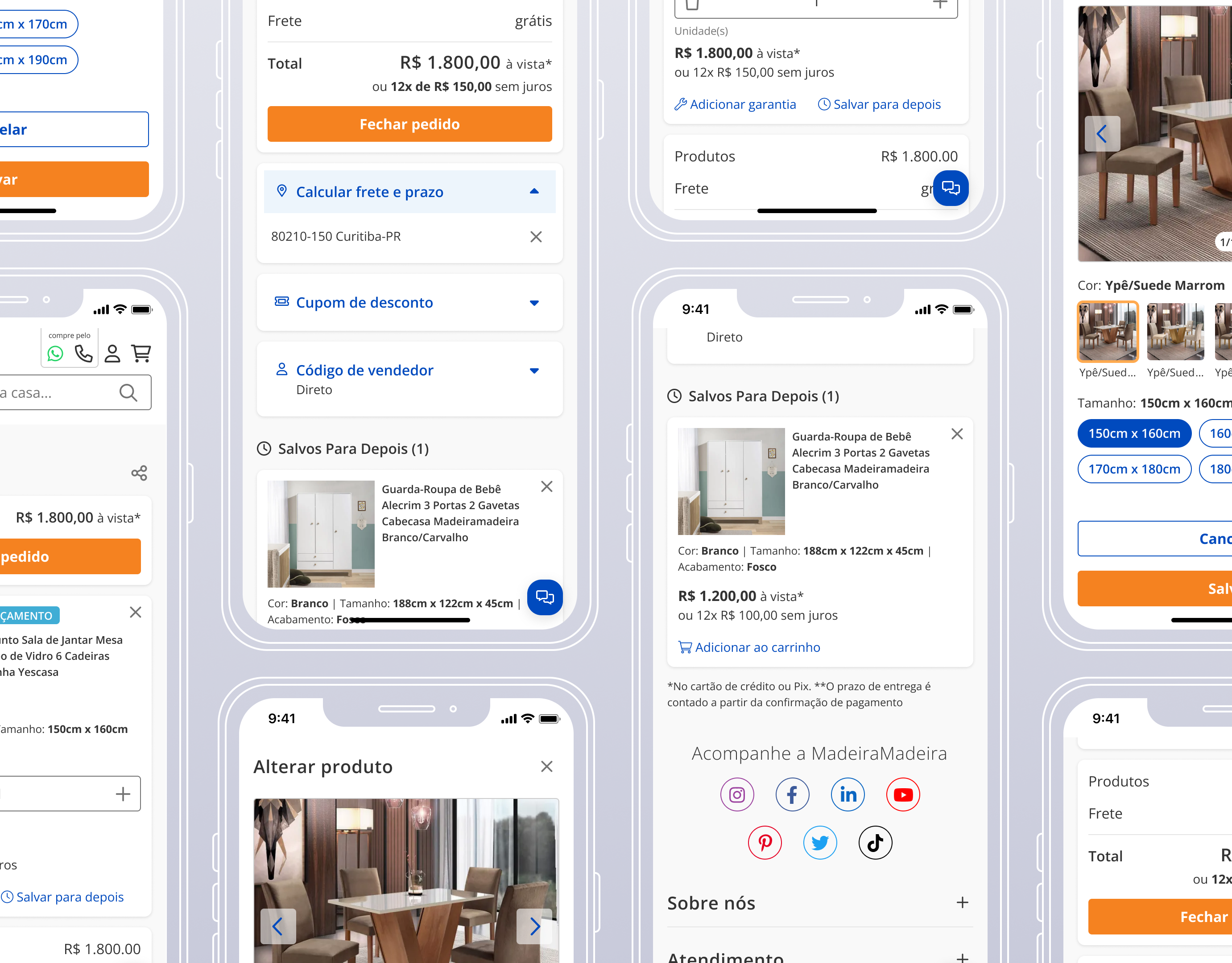
The app’s Onboarding and Feedback screens relied on static visuals. While the UI provided clear messages, the lack of motion made these key moments feel flat and emotionally disconnected.
We saw an opportunity to:
• Make onboarding more welcoming and brand-aligned;
• Add visual hierarchy to feedback states;
• Reinforce clarity and user confidence through subtle animations.
• Add visual hierarchy to feedback states;
• Reinforce clarity and user confidence through subtle animations.
2. Project Goals
• Introduce purposeful motion to enhance comprehension and delight;
• Express brand personality through animation and illustration;
• Keep animations lightweight, and non-disruptive.
• Express brand personality through animation and illustration;
• Keep animations lightweight, and non-disruptive.
3. Solution
We worked with simple, geometric shapes, used the Design System’s color palette, and applied soft gradients to selected elements for visual interest. Once the illustrations were designed in Figma by my colleagues and approved, I animated them in Jitter, a web-based motion tool that allowed for an efficient handoff and smooth workflow.
3.1 Onboarding Flow
Inspired by the app’s slogan “A digital account for those who love to travel”, we brought that message to life through illustration. The onboarding sequence features four rotating city skylines, each paired with a subtle animation of an airplane crossing the sky. This not only reinforced the travel theme, but also added movement and personality to the first moments of the user experience.
3.2 Feedback Screens
To maintain consistency and reinforce the travel theme, we reused the four city skylines in the success animations, rotating them randomly to keep the experience dynamic and visually engaging. For warning and error states, we opted for a neutral, generic city illustration to avoid associating any specific location with a negative outcome. In these cases, we also removed the airplane animation, which was reserved exclusively for success scenarios as a symbol of progress and achievement.
Handoff & Implementation
We split the animations into two types to optimize both performance and development effort:
• Lottie (JSON) animations: Complex animated illustrations created in Jitter and exported as Lottie files. These were used for visual elements that would be time-consuming to replicate in code, offering smooth performance and easy integration;
• Code-based animations: Simpler transitions, such as background shapes or text fades, were documented and handed off with clear specs for developers to implement directly in code.
Impact & Lessons Learned
Although the animations are not live yet and we don’t have quantitative results, this project laid important groundwork for integrating motion into the user experience at PaGol. It was my first project fully focused on Motion Design and using Jitter, where I learned how to balance expressiveness with usability, optimize animations for handoff, and collaborate more closely with developers.
This initiative also revealed the need for a Motion section in our Style Guide—a next step that will help standardize motion across the product and make it easier to scale.
On a personal level, this project sparked a deeper interest in Motion Design, and I plan to continue growing in this area across future projects and platforms.