Role: Product Designer / Team: Design System Squad (3 designers) / Platform: Responsive Web / Scope: Research, UX/UI Design, Prototyping, Design System / Tools: Figma, Google Sheets, Confluence / 2021
1. Problem & Opportunity
With the website being rebuilt using new technologies, teams faced duplicated work, inconsistent interfaces, and design-debt issues.
The opportunity:
• Establish a design system to standardize the UI.
• Accelerate development through reusable components.
• Enable scalability across multiple squads and product areas.
The opportunity:
• Establish a design system to standardize the UI.
• Accelerate development through reusable components.
• Enable scalability across multiple squads and product areas.
The first milestone was redesigning the homepage, product listing, and product details pages with Cavilha at the core.
2. Solution
We created a system of base and feature components designed with accessibility, flexibility, and real use cases in mind.
My contributions:
• Defined design tokens for spacing, color, typography, and themes (including dark mode).
• Designed variant-heavy, accessible components in Figma using atomic principles.
• Led component variation mapping and benchmarking to align with user expectations and market standards.
• Wrote and maintained component documentation across Figma and Confluence, including usage guidelines and accessibility notes.
• Participated in cross-functional reviews with dev, QA, and design teams to ensure implementation quality.
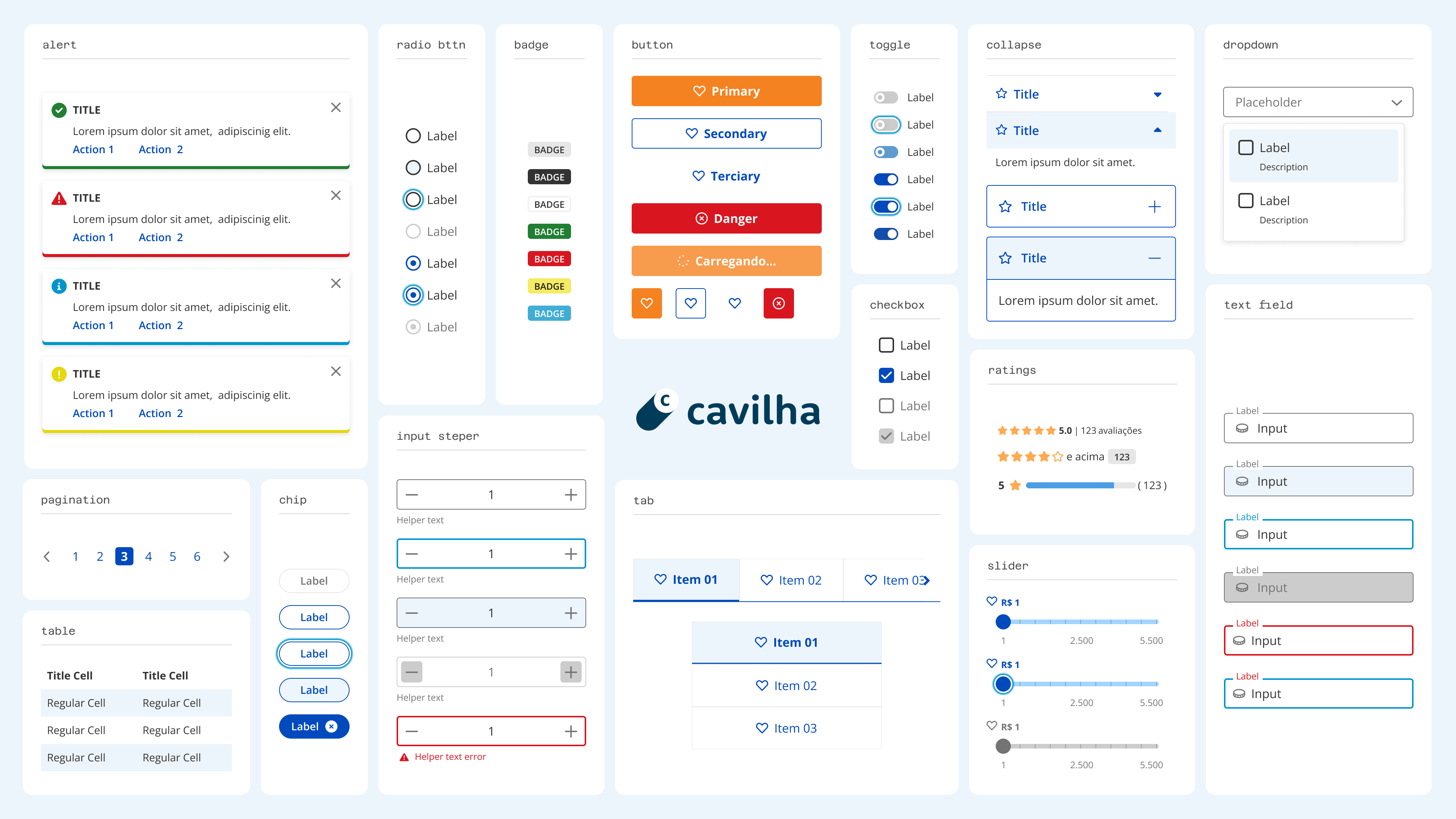
Base Library's main components in Light Mode.
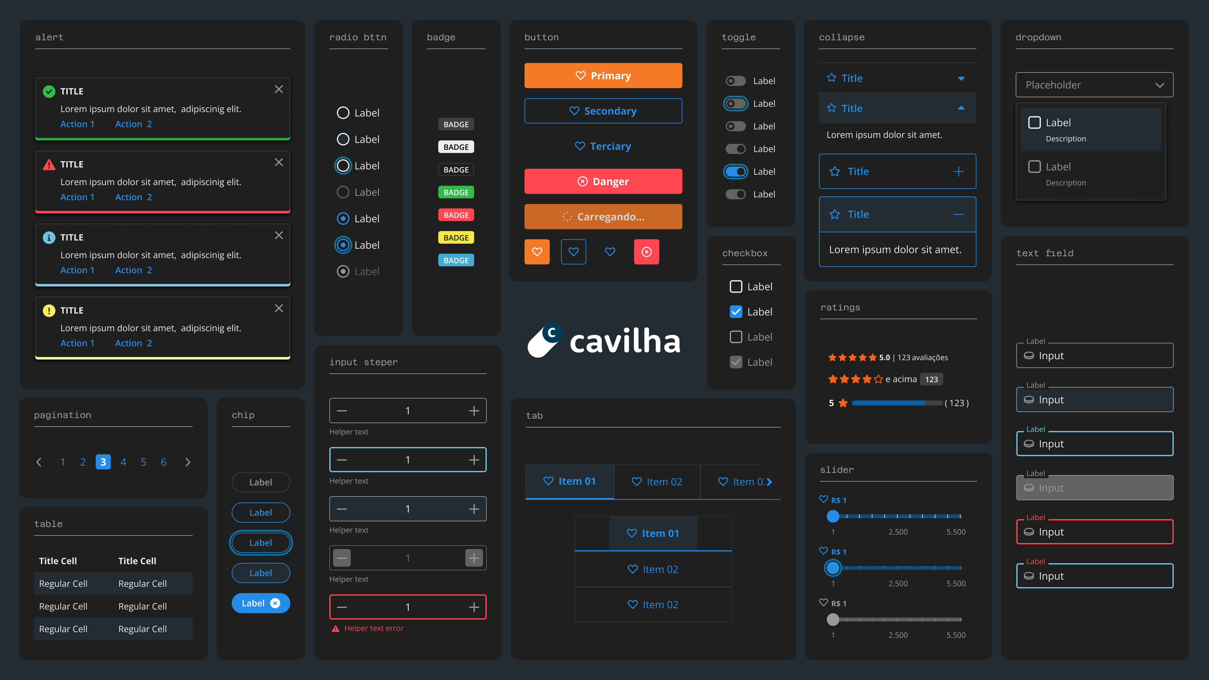
Base Library's main components in Dark Mode.
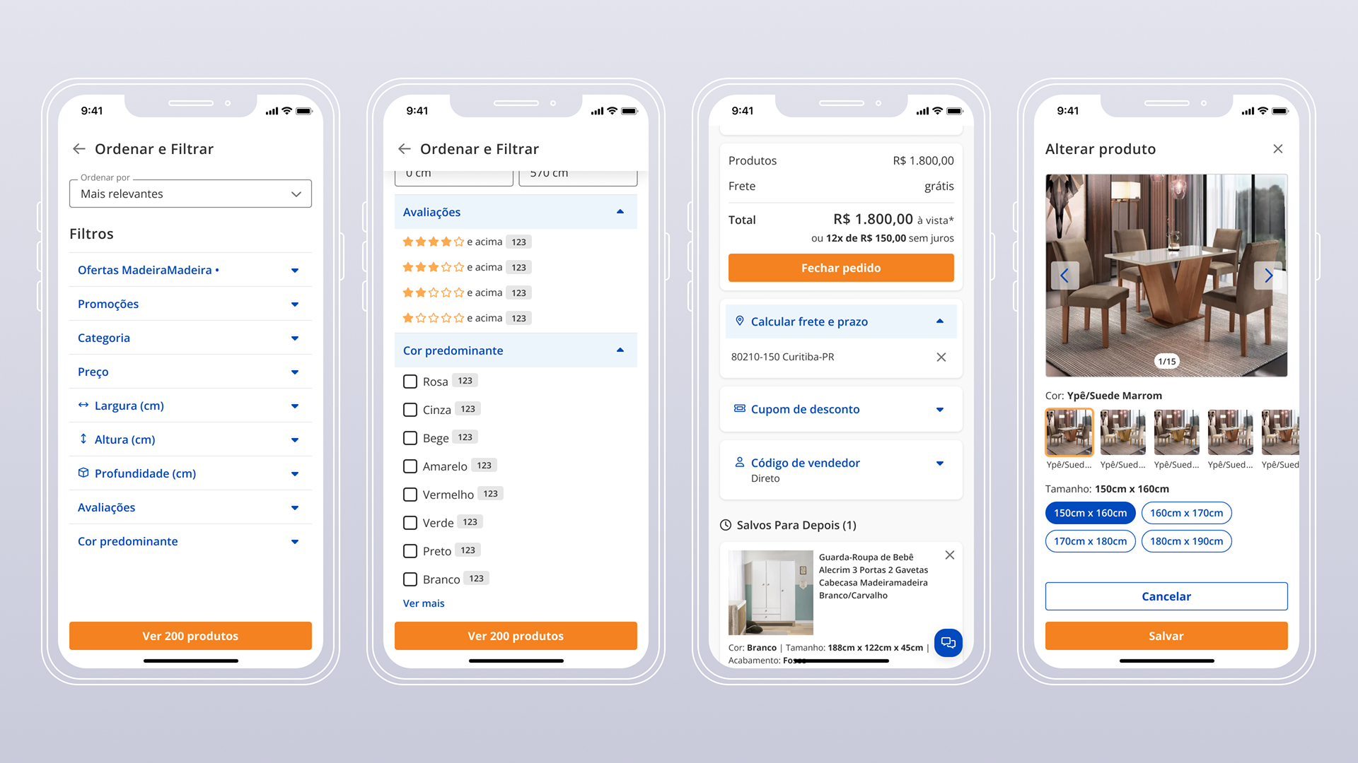
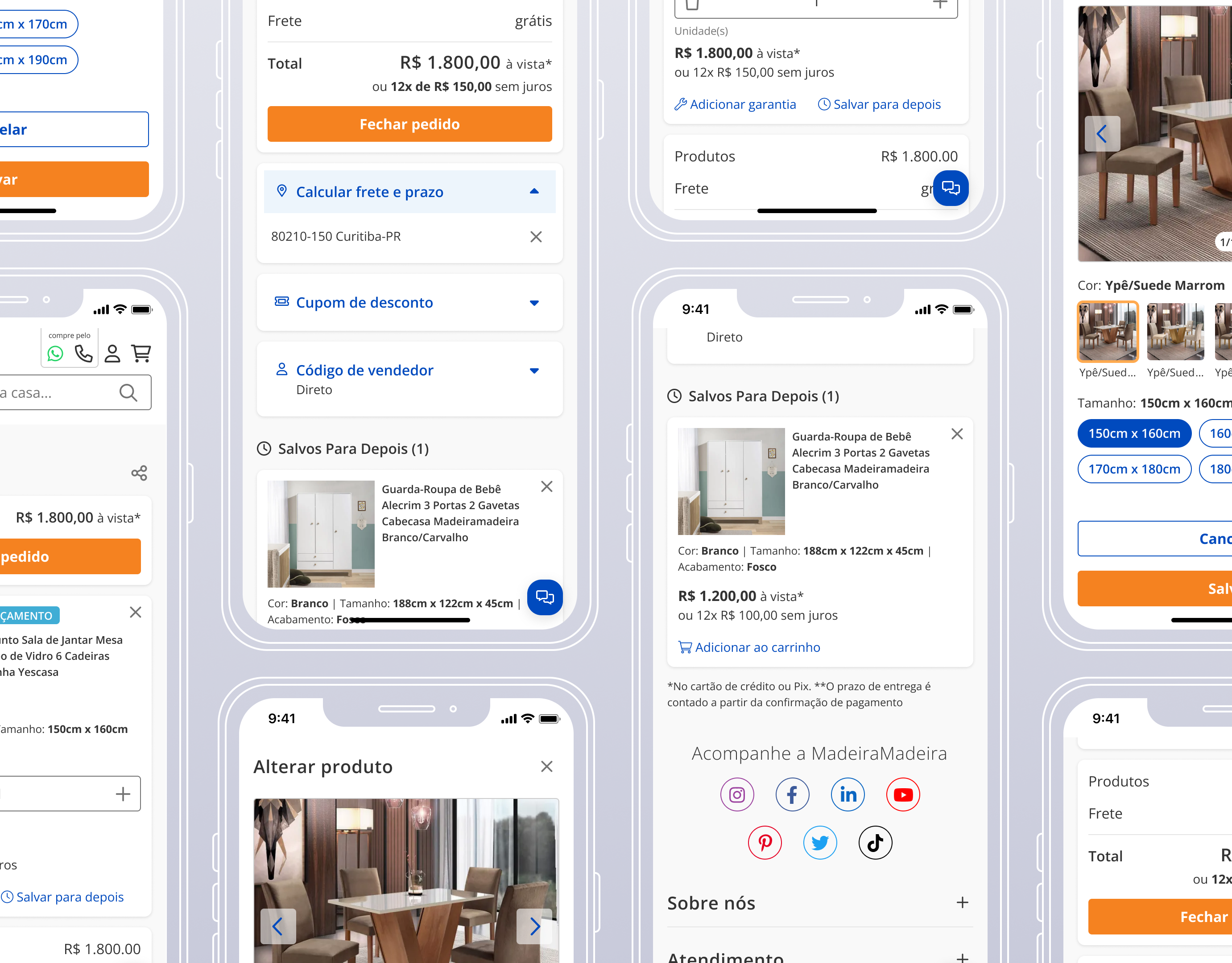
Product Filters and Shopping Cart screens created with the Design System.
Our component creation process followed these steps:
Variation Mapping → Benchmarking → Visual Design → Documentation → Review & Iteration.
Variation Mapping → Benchmarking → Visual Design → Documentation → Review & Iteration.

Component inventory sheet that helped to decide which components to prioritize.
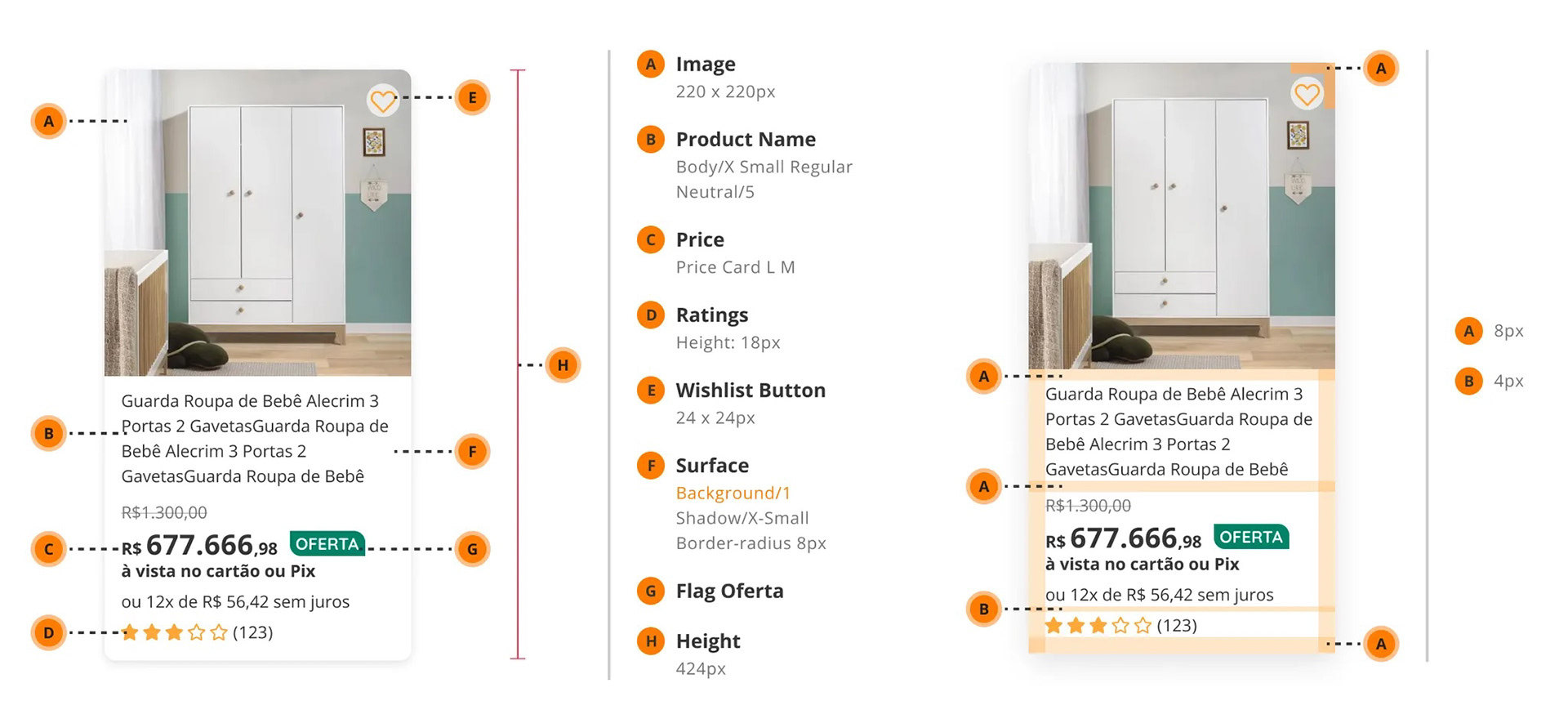
Detail of the Product Card's documentation.
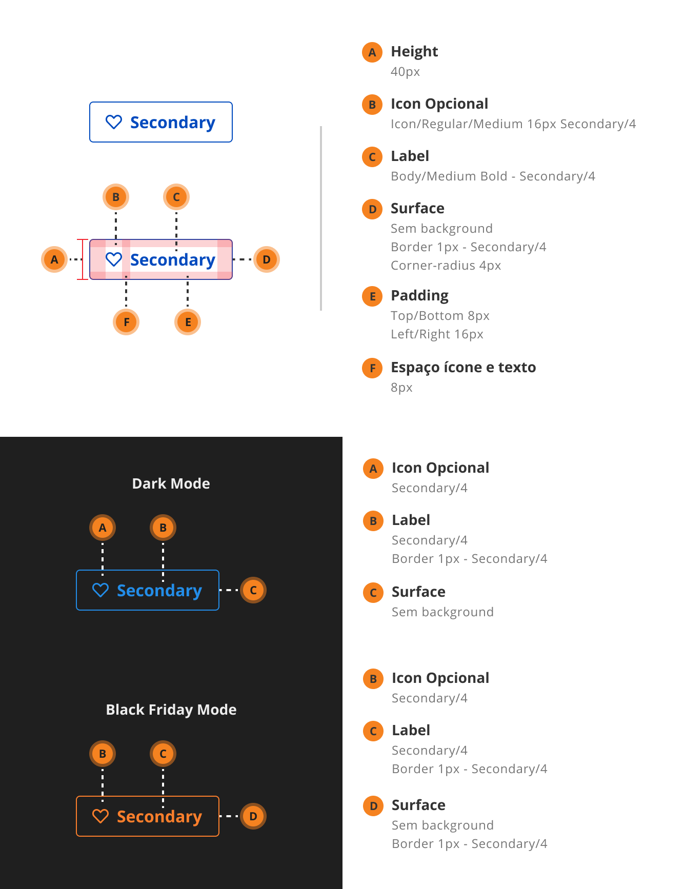
Detail of the Secondary Button's documentation.
3. Impact & Reflections
Results:
• 82% of the platform was using Cavilha within 6 months (up from 38%).
• 32% reduction in development time due to reusable components.
• Design System NPS increased from +14 to +62, showing improved team satisfaction.
• 32% reduction in development time due to reusable components.
• Design System NPS increased from +14 to +62, showing improved team satisfaction.
Key Learnings:
• How to apply design tokens across multiple themes and platforms.
• Built scalable Figma components with variant logic that simplified team workflows.
• Improved skills in design-dev collaboration and maintaining living documentation.
• Built scalable Figma components with variant logic that simplified team workflows.
• Improved skills in design-dev collaboration and maintaining living documentation.
What I'd Do Differently:
• Introduce a multi-level token system (primitive, semantic, component) for better theme control.
• Use Figma Variables (not available at the time) to manage tokens and themes more efficiently.
• Use Figma Variables (not available at the time) to manage tokens and themes more efficiently.