Role: Product Designer (leading) / Team: Design Chapter (3 designers) / Platform: Mobile App (iOS-Android) / Scope: Research, UX/UI Design, Prototyping / Tools: Figma / 2024
1. Problem Statement & Opportunity
The app’s legacy design system lacked:
• Visual alignment with the PaGol brand.
• Flexibility for scaling new features.
• Accessibility best practices.
• Clarity in design-to-dev handoff.
• Flexibility for scaling new features.
• Accessibility best practices.
• Clarity in design-to-dev handoff.
This was impacting:
• User trust and engagement.
• Team velocity and consistency in UI implementation.
• Long-term scalability of the design language.
• Team velocity and consistency in UI implementation.
• Long-term scalability of the design language.
Opportunity: Build a scalable, accessible Style Guide that could immediately improve visual consistency and developer efficiency while supporting the product’s growth.
The old UI Design using the white label library.
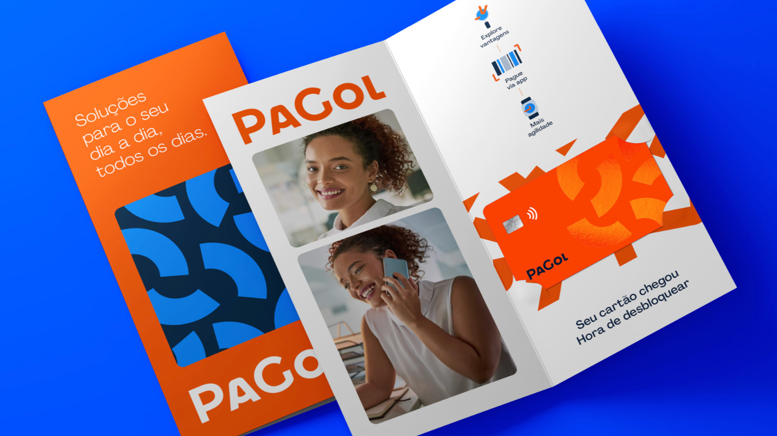
An example of printed material from the brand guidelines.
An example from the brand guidelines.

An example of a magazine ad from the brand guidelines.
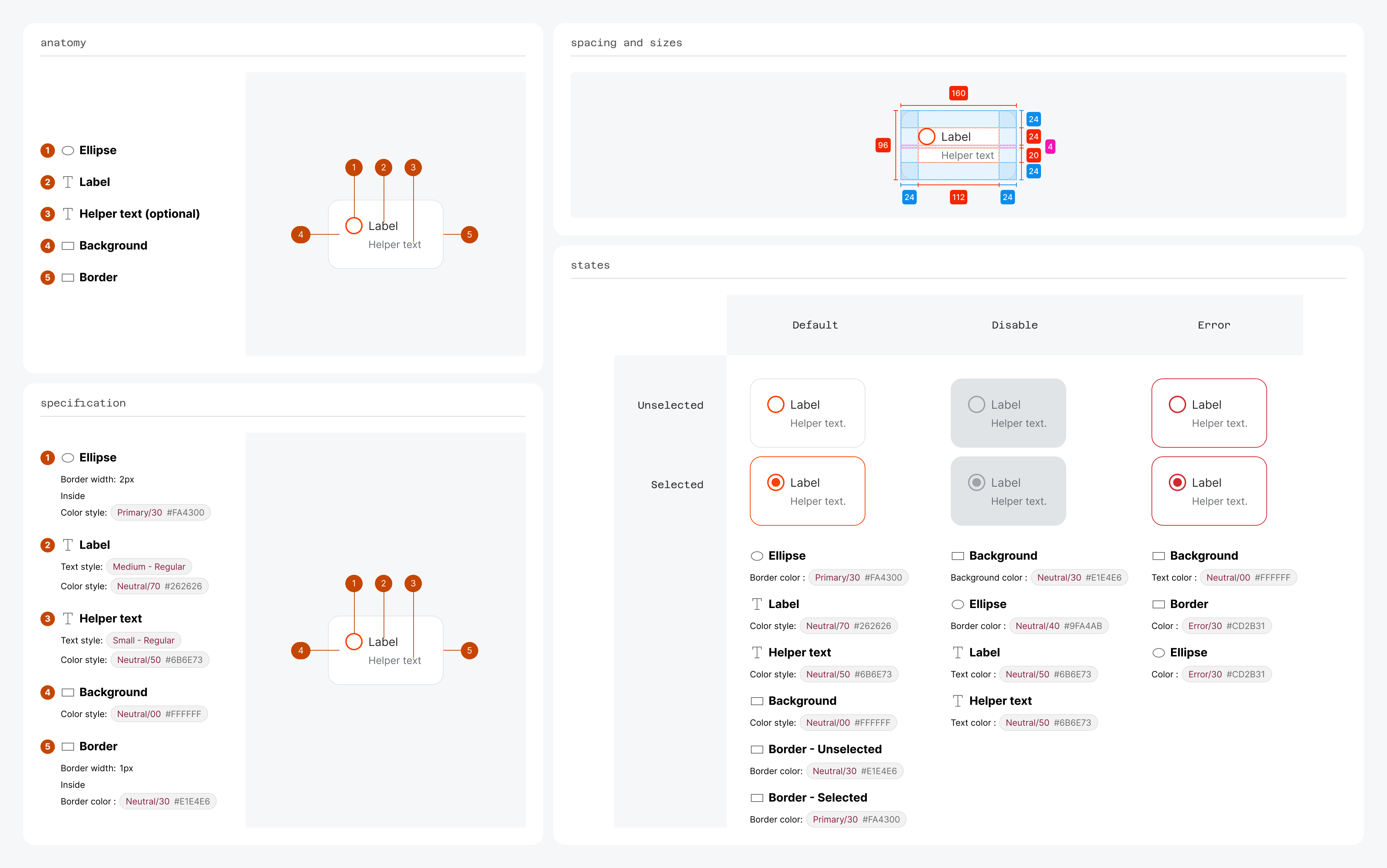
2. Solution
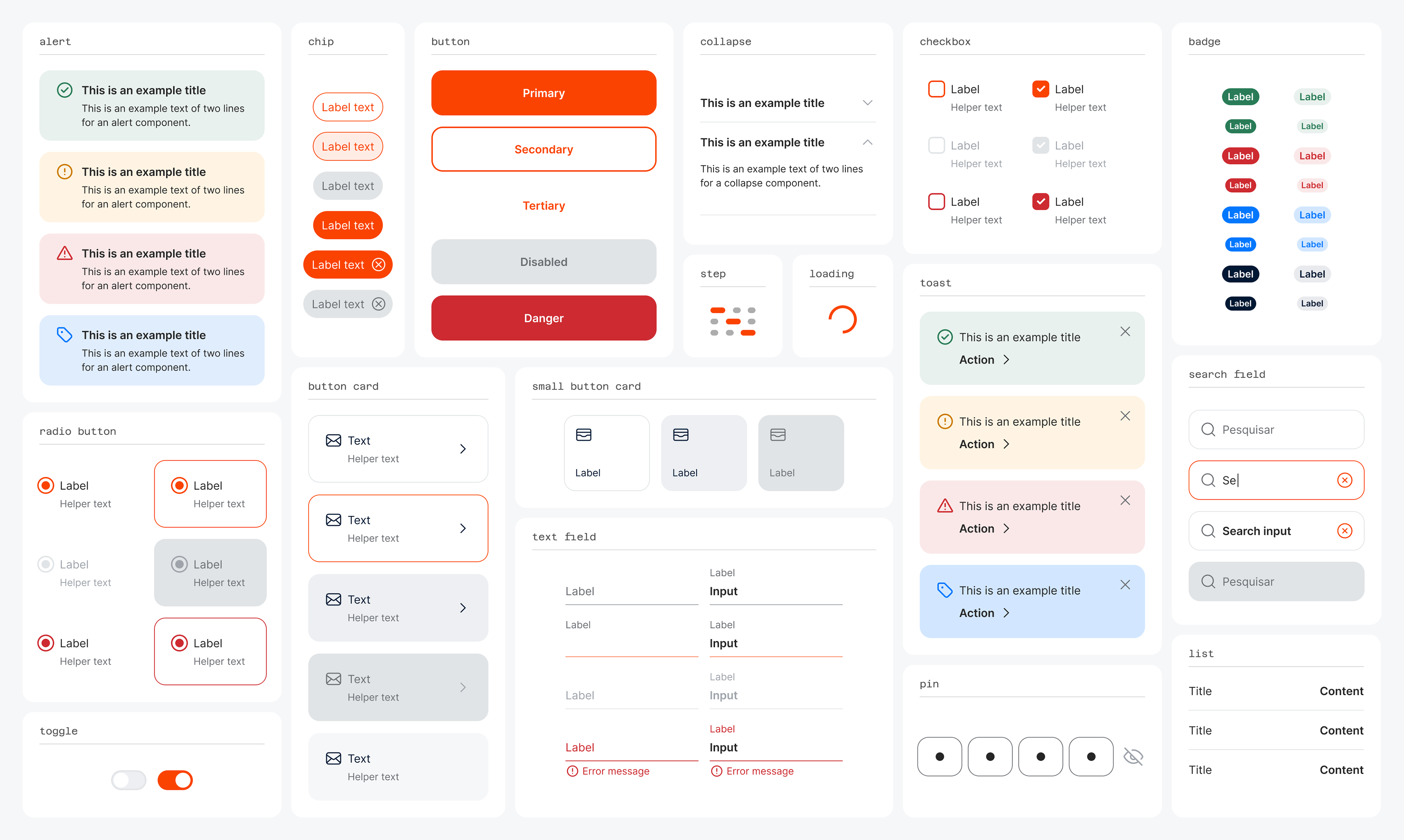
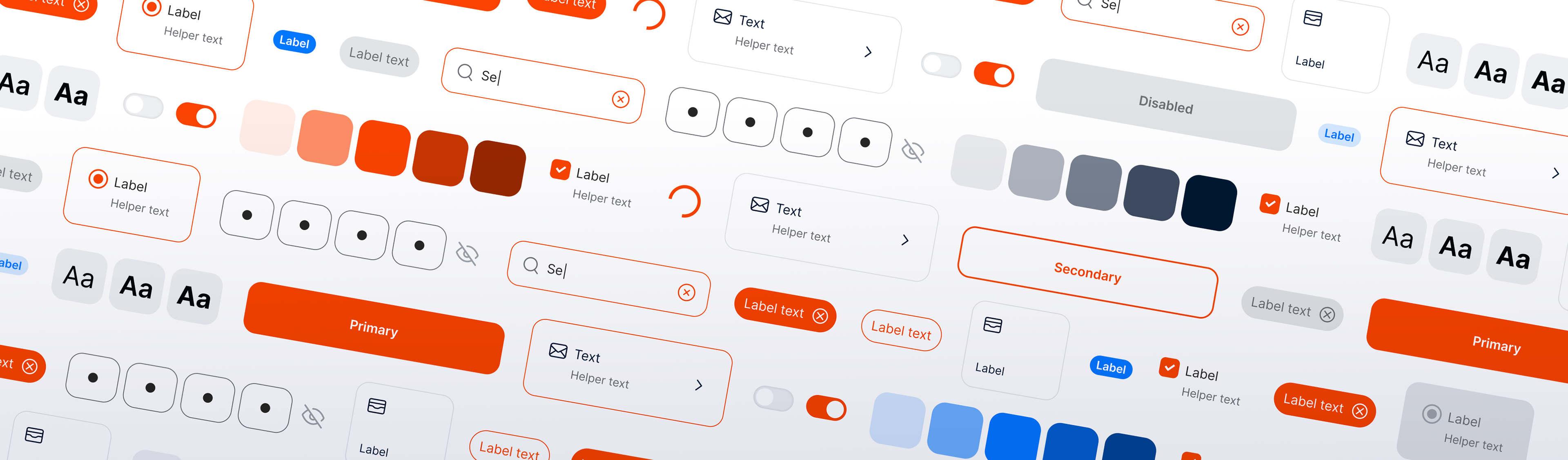
The main components created in the library.
I led the end-to-end initiative, collaborating with two designers and aligning closely with developers. Our approach included:
2.1 Foundational Design Decisions:
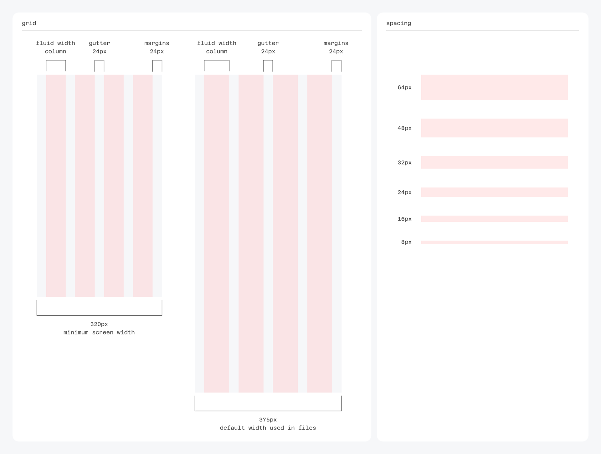
Grid: Fluid 4-column with 4px base spacing.
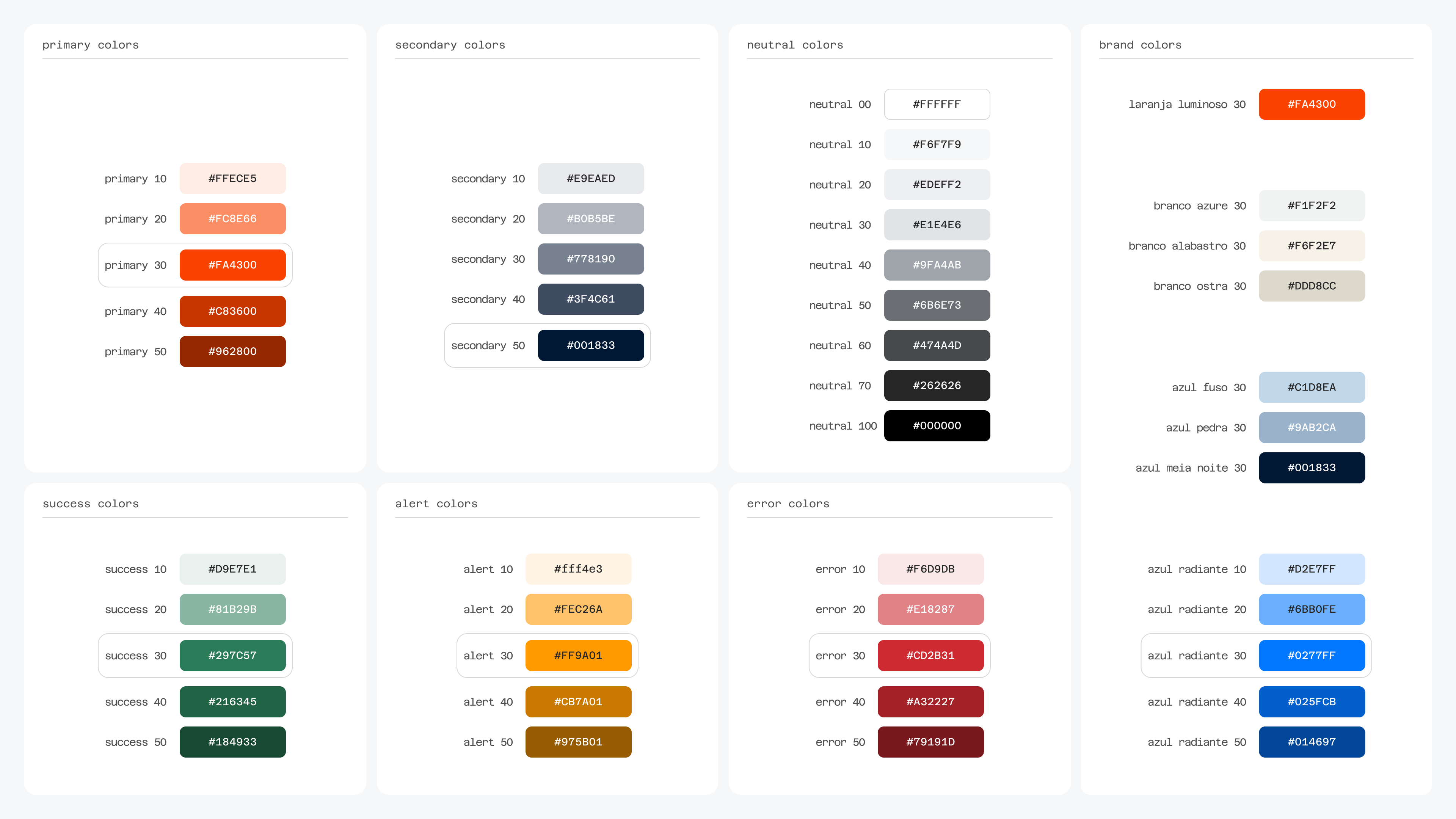
Color: Expanded palette with accessible contrast and semantic roles.
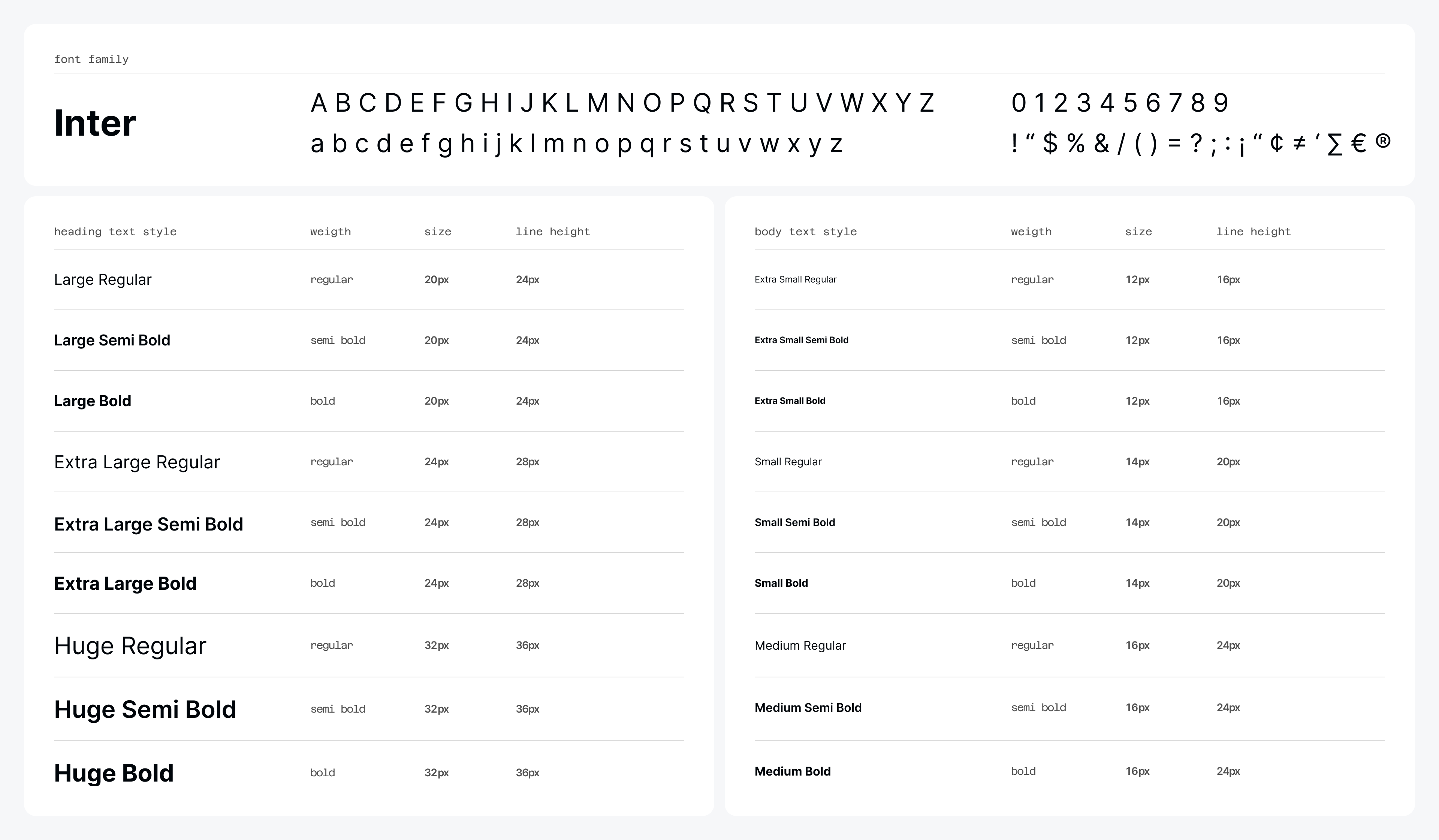
Typography: Inter typeface with 18 defined text styles.
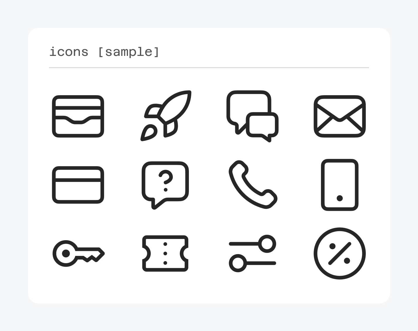
Iconography: Material Icons for consistency and clarity.
2.2 Documentation in Figma:
• Clear structure covering purpose, anatomy, best practices, states, and accessibility.
• Plugins used: DesignDoc Spectral and EightShapes Specs.
• All components documented with usage guidelines, examples, and specs.
• Plugins used: DesignDoc Spectral and EightShapes Specs.
• All components documented with usage guidelines, examples, and specs.
2.3 Collaboration & Workflow:
• Weekly critiques for shared ownership and quality control.
• Integrated documentation into day-to-day product squad work.
• Integrated documentation into day-to-day product squad work.
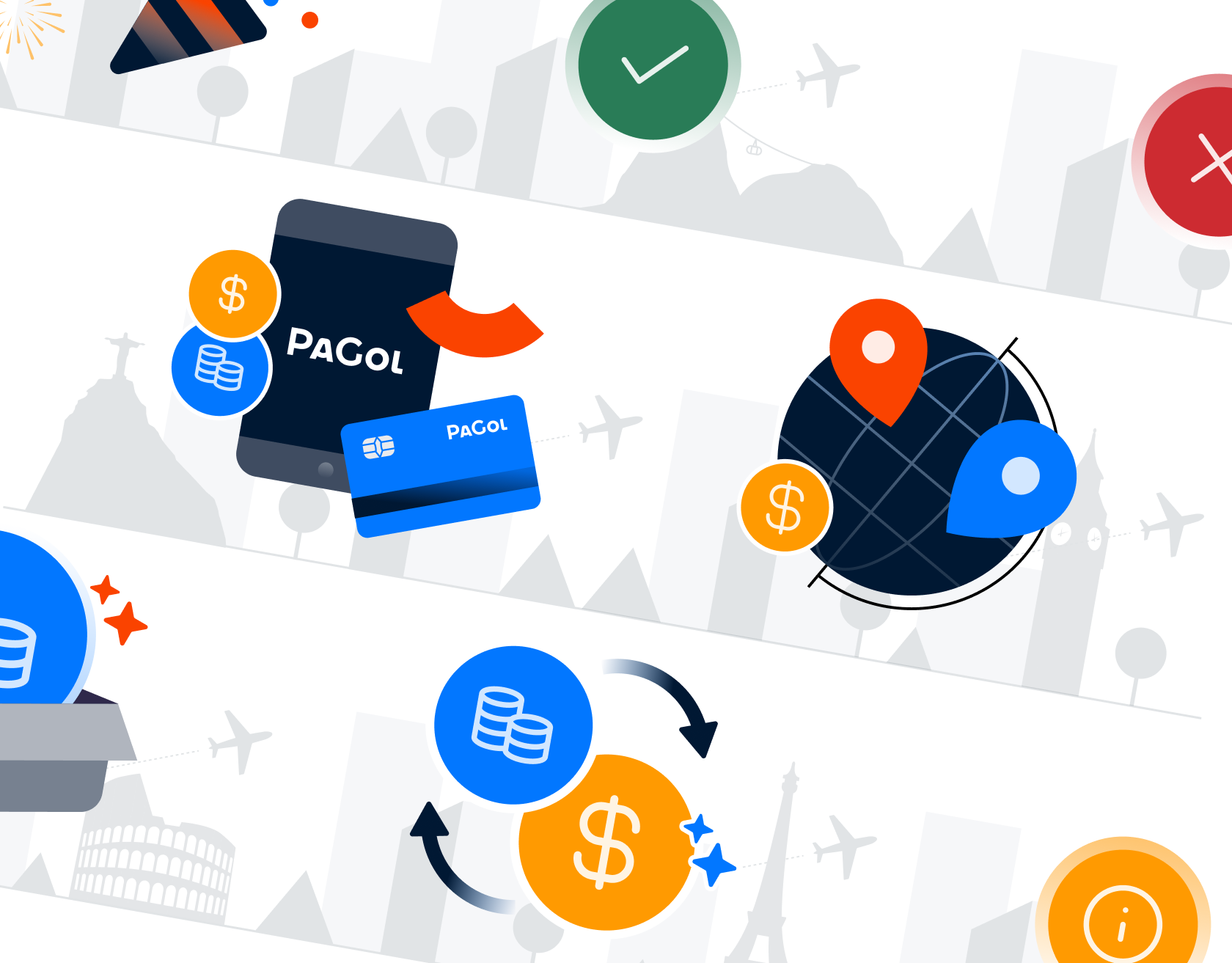
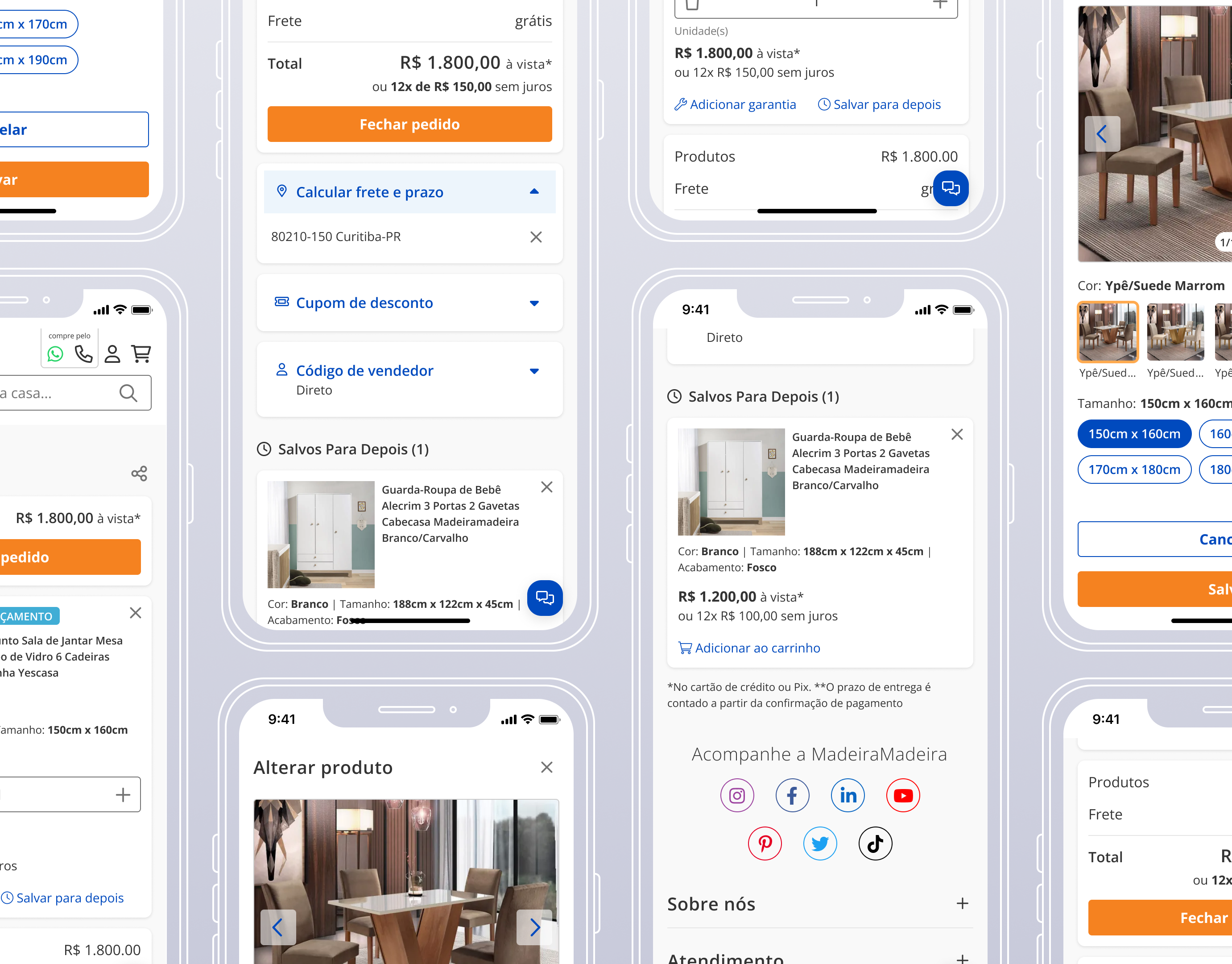
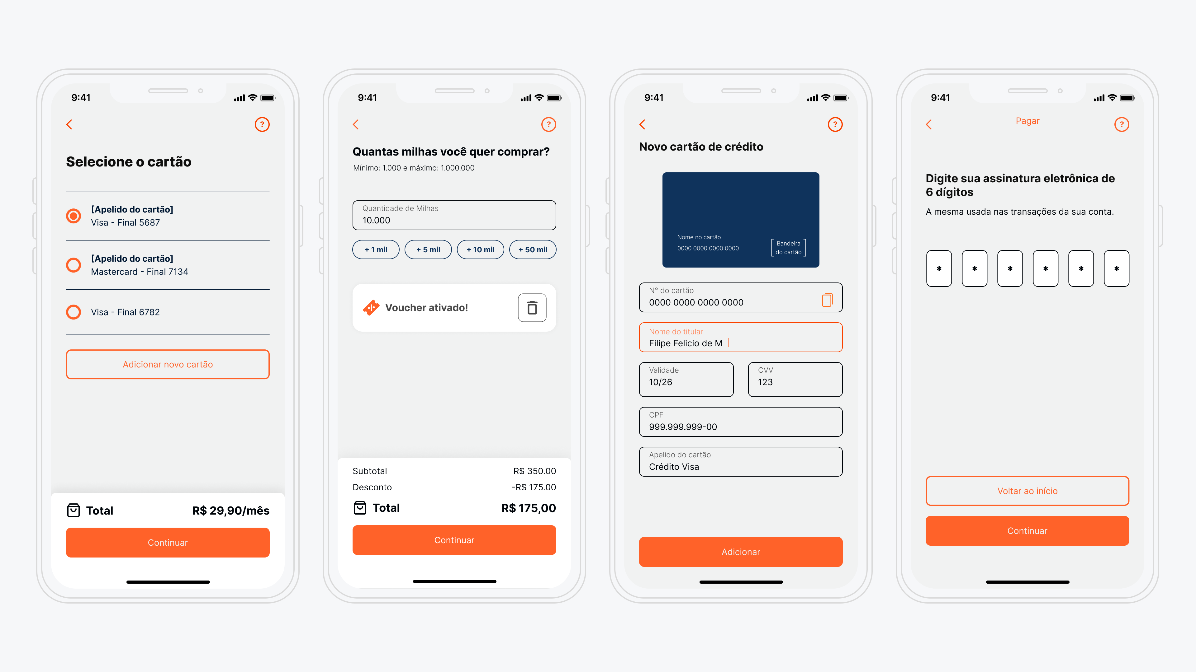
2.4 UI Designs using the Style Guide

Credit card selection / Credit card addition
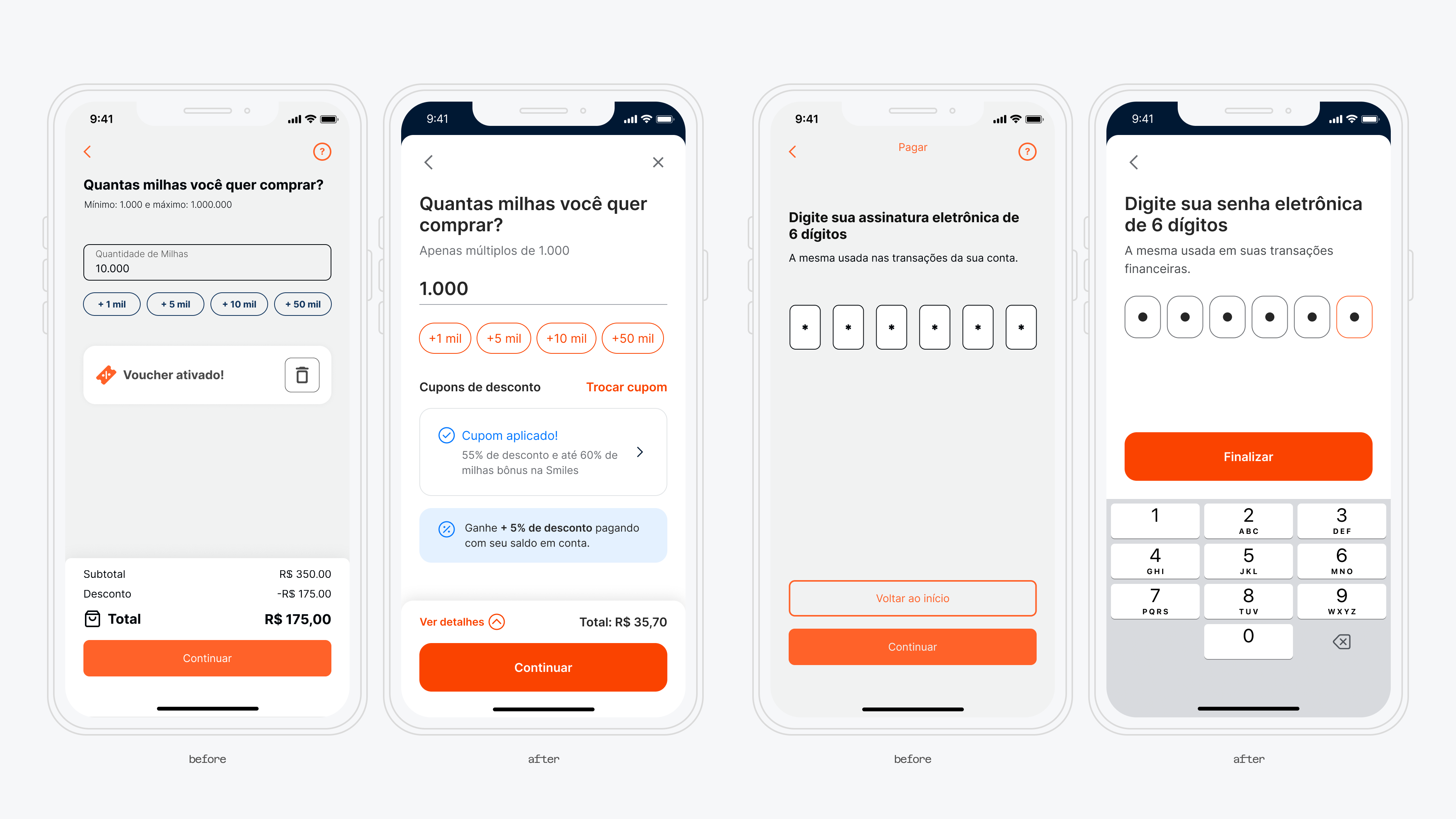
Miles buying / Pin input screen
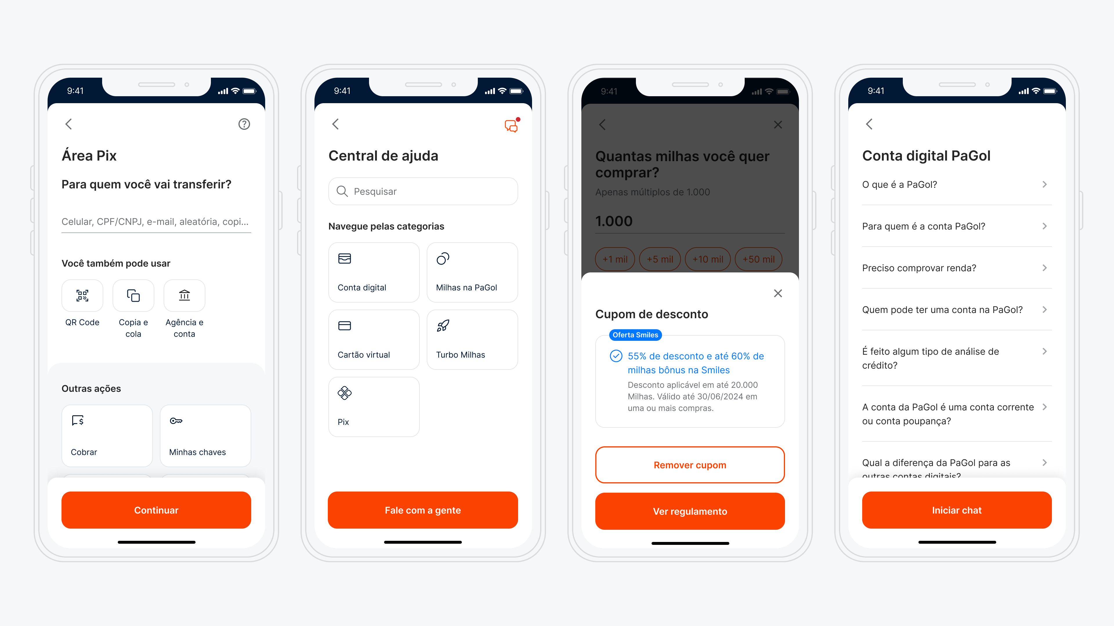
Pix area (money transfer) / Help page / Discount coupon / List of help articles.
3. Impact & Reflections
The Style Guide brought immediate value by improving visual consistency and speeding up design and development decisions. Designers spent less time on repetitive choices, and developers had clearer specs to work from. Even without a dedicated Design System team, our collaborative process, with weekly critiques and hands-on documentation, fostered alignment and efficiency. This project laid a solid foundation for a future Design System and proved that even with limited resources, a well-structured Style Guide can elevate both team workflows and user experience.